Sharing is caring!
THE BACKSTORY
THE EXTERIOR:
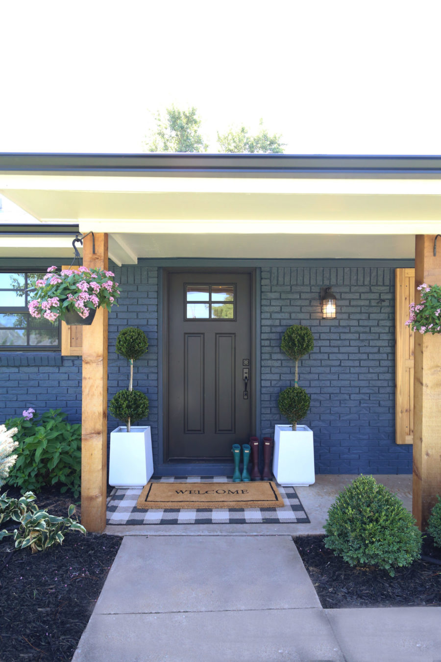
I knew immediately that I wanted to do something different on this beautiful ranch style home that was originally built in the 1950s. I didn’t want to do just white if you know what I mean. Don’t get me wrong. I love white. My entire house is painted white brick.
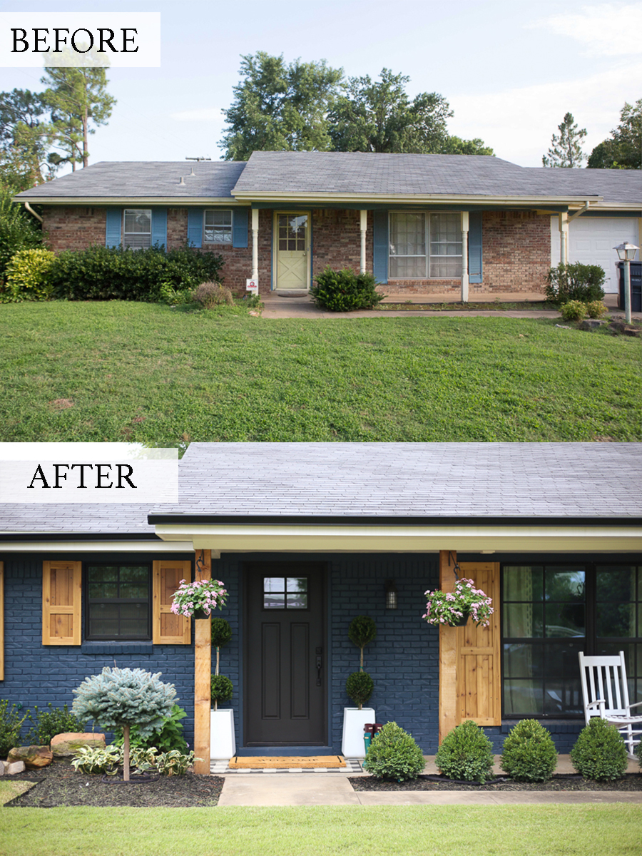
But the beauty of this home is that because of the size of the exterior, I felt it could totally pull off something more dramatic and moody. I knew I wanted to go with a deep blue color on the exterior and pair it with cedar shutters and accents. I absolutely love the way it turned out.
PAINT COLOR: Brick is Sherwin Williams Gale Force, Trim and Door are Sherwin Caviar
SHOP THE FRONT PORCH LOOK:

THE BEFORE AND AFTERS:
RANCH STYLE OPEN CONCEPT
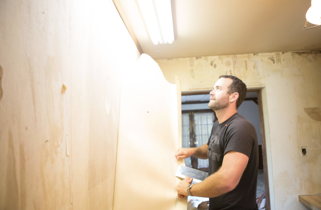
HGTV came out to this site to film a pilot at the beginning of this project. Mike and I got caught up in the excitement of “demo day” while the film crew spurred us on! Unfortunately, they decided not to continue filming and we had already knocked down an entire wall! We literally sat on the house for a year before Mike finally let me run rampant with the design. It was a blessing in disguise because we would not have torn the wall down otherwise. It looks amazing and completely opened up the house. Thank you HGTV!
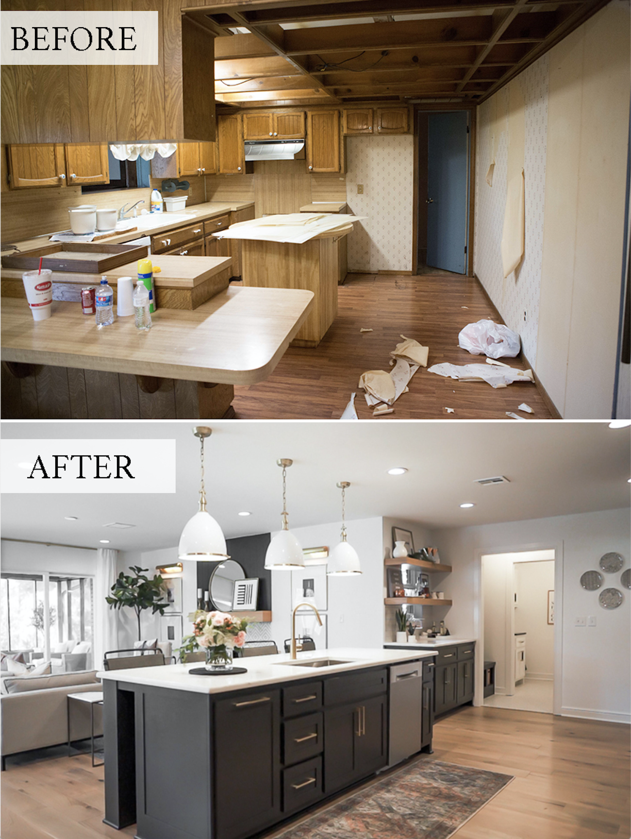
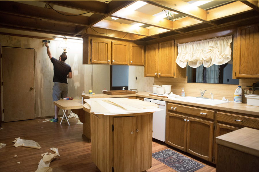
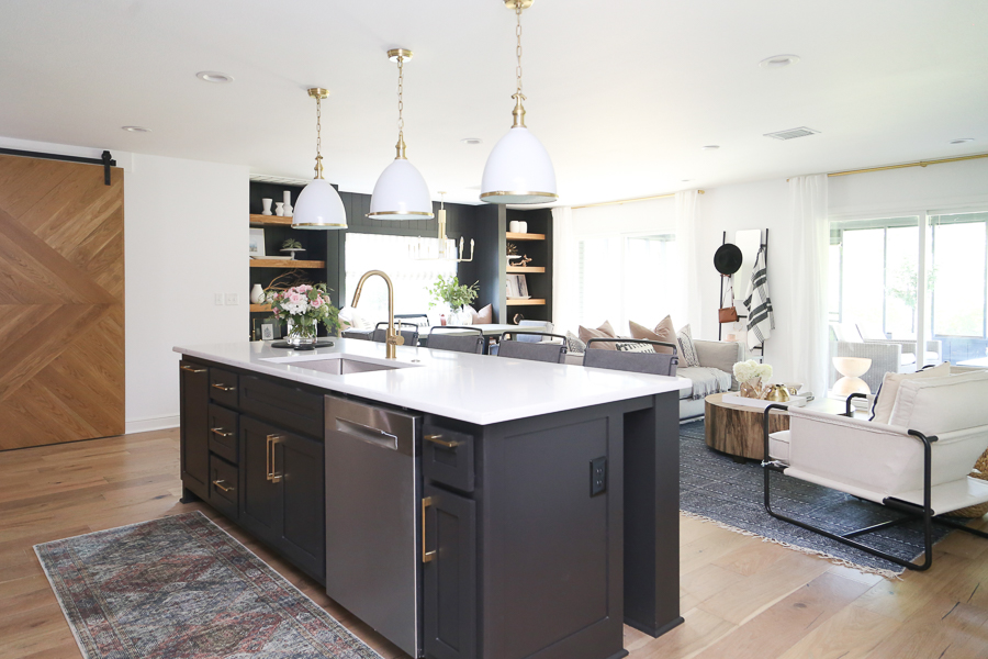
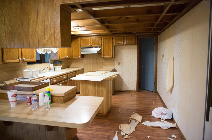
Here are the dramatic BEFORE and AFTERS of how we took this kitchen from a dark, closed-off kitchen with dropped ceilings and dated wallpaper, to a stunning, open concept kitchen with a large island, open shelving, and plenty of WOW!
THE KITCHEN
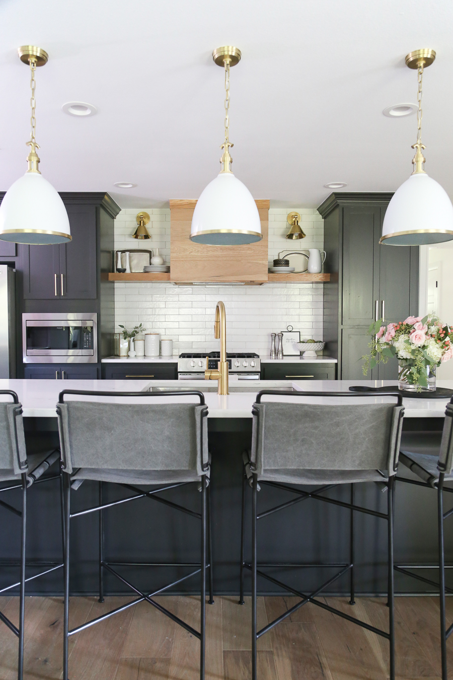
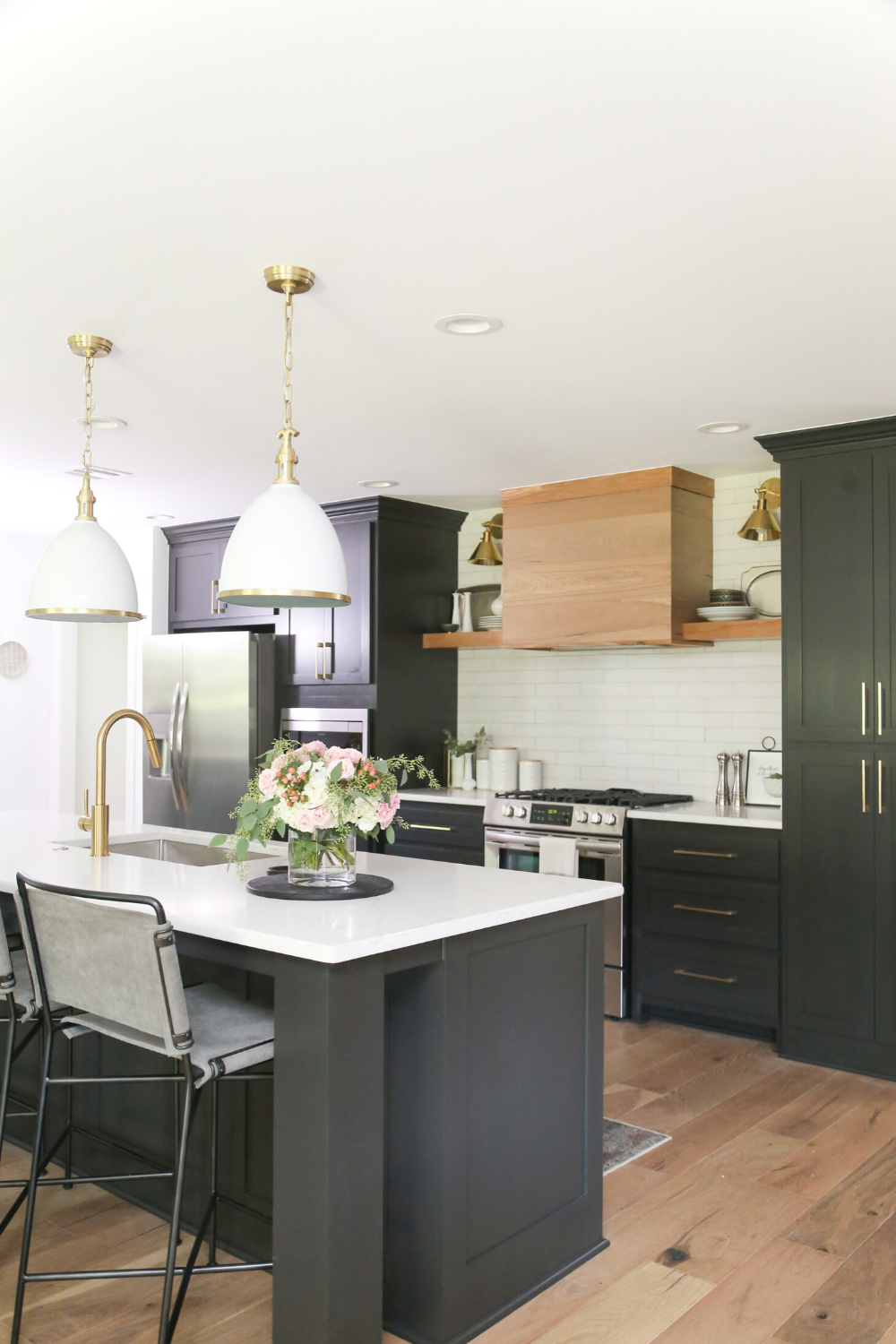
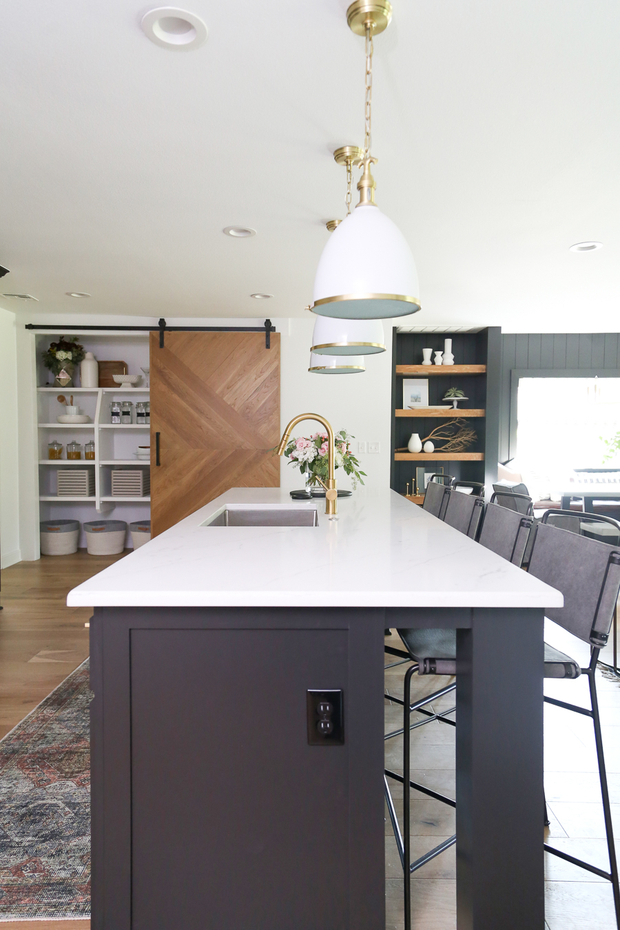
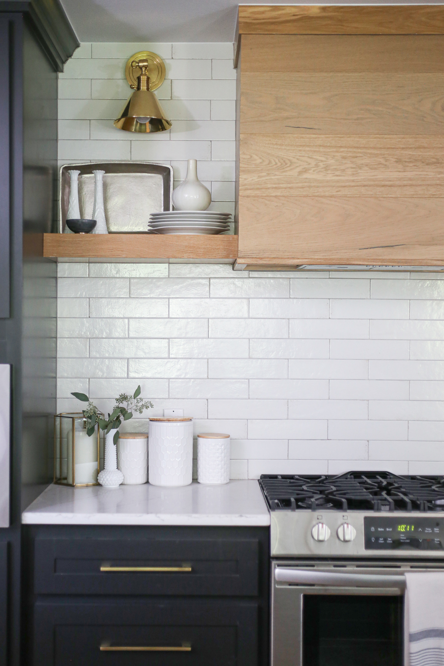
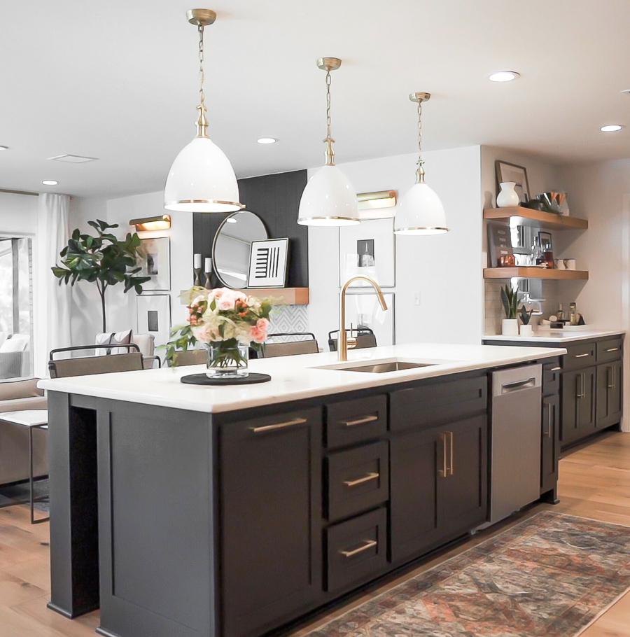
The flip house kitchen was a perfect opportunity for me to have a little fun and do some design work that I knew Mike probably wouldn’t go for in our personal home – in other words, BLACK CABINETS mixed with warm wood tones. It’s no secret that I love black and white in design and you will often hear me say; “You know what never goes out of style? Black and white.” I also wanted to incorporate some open shelving and sconces and the sliding pantry door was a nice, bold touch for impact!
RECREATE THIS LOOK WITH THESE PRODUCTS:
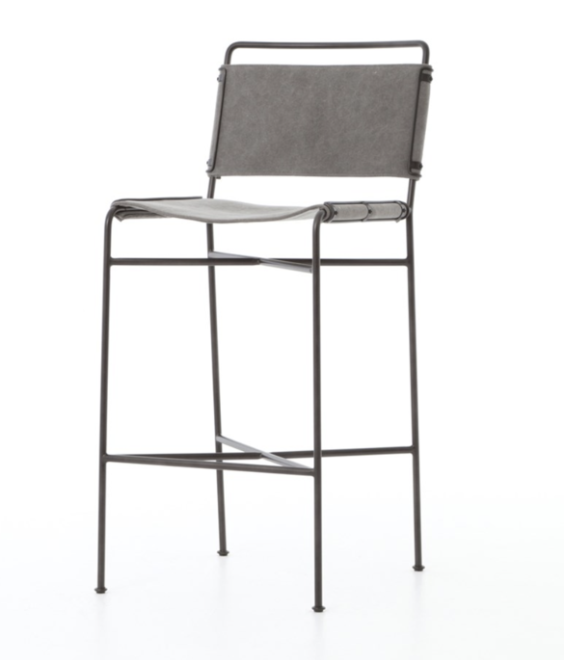
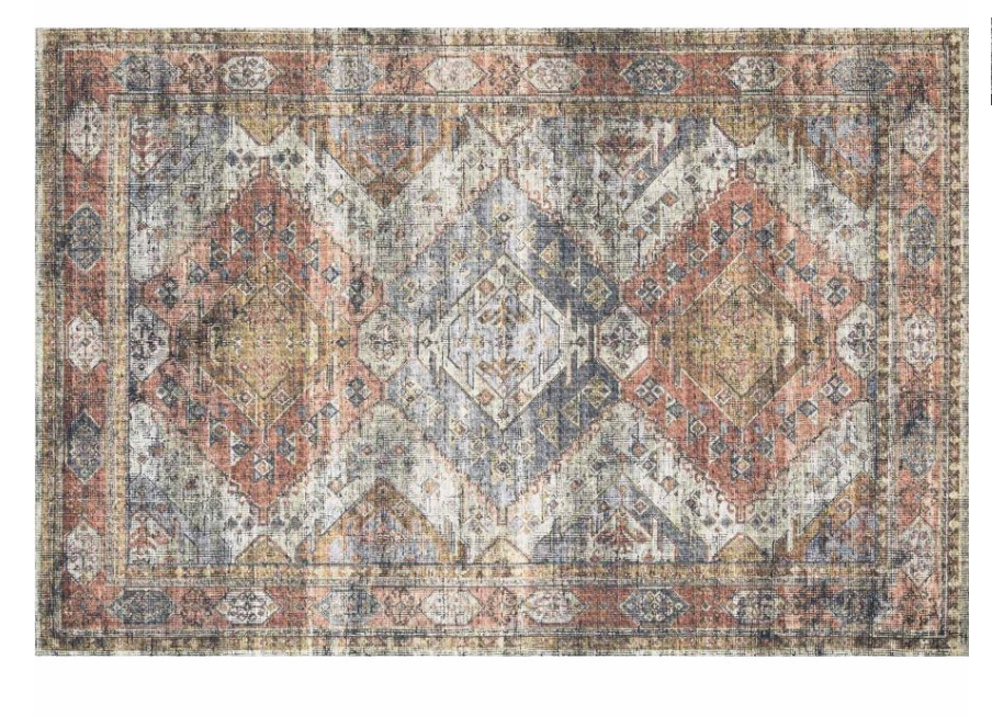
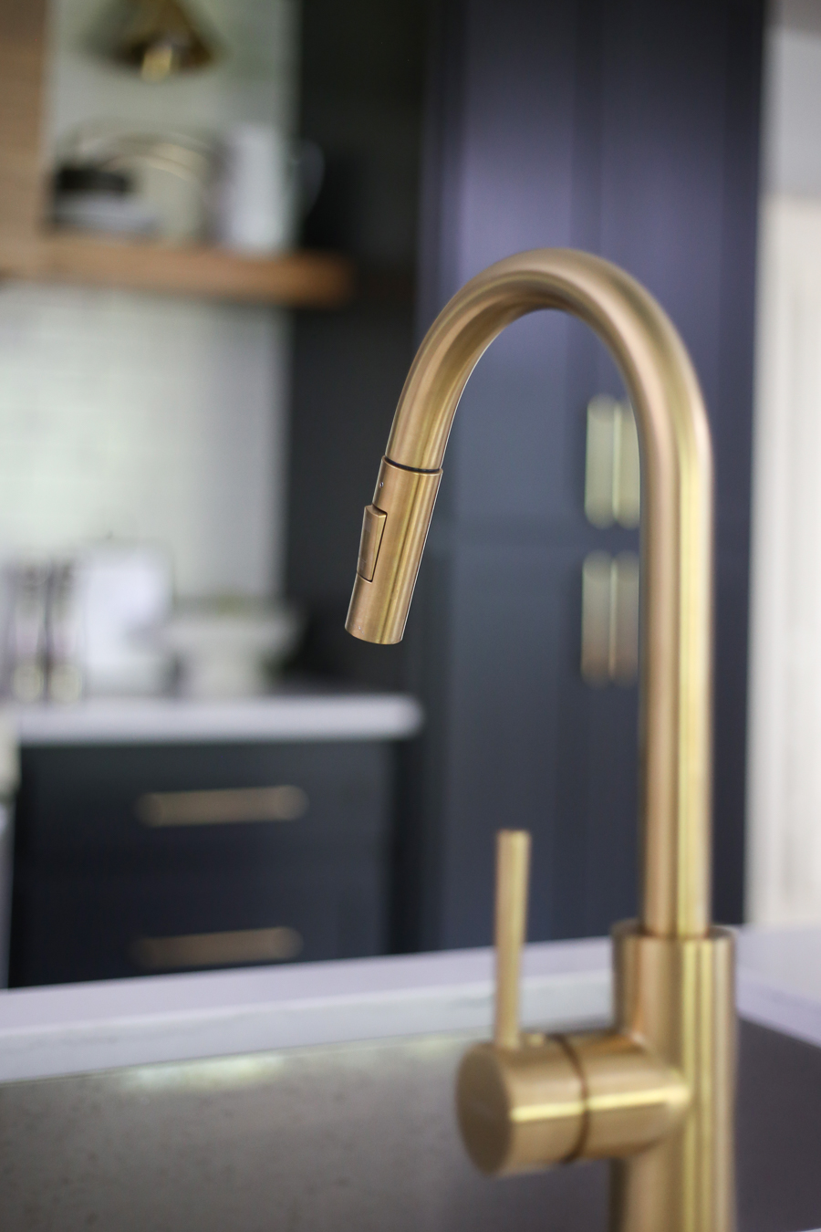
GREY CANVAS BAR STOOL | APRICOT/ MIST SKYE RUG| Viceroy Pendant| Kitchen Sink| Kitchen faucet| Gold hardware| Sconce
WOOD FLOORS –
Wood floors were provided by Mill Creek Carpet and Tile. They provided all flooring and tile for this project and we absolutely loved working with them. They were so helpful throughout the selection process and their customer service all the way through installation was incredible. If you are local to Tulsa or Oklahoma City, I highly recommend using Mill Creek and you can even go in and tell them you want to see CC and Mike’s favorites and they have a board put together of items we used on our flip house! The floors we selected were Bella Cera Monza Collection in French Oak Bivio.
If you are not in Tulsa, you can purchase the flooring we used in the flip house project here:

SHOP KITCHEN STYLING ITEMS:

QUARTZ: London Skye by Corian Quartz
VENT HOOD: We created this vent hood look by using the same wood flooring that we used throughout the house, on the vent hood. We had our trim carpenters cut the Bella Cerra engineered wood floors to fit the size of the vent hood then attached them to the front and sides of the vent hood. It was actually Mike Miller’s idea and I absolutely LOVE how it turned out!
PAINT: Cabinets are Benjamin Moore Black Beauty and walls are Benjamin Moore Decorator’s White in Eggshell finish
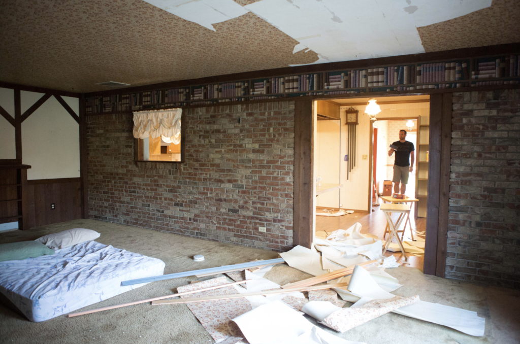
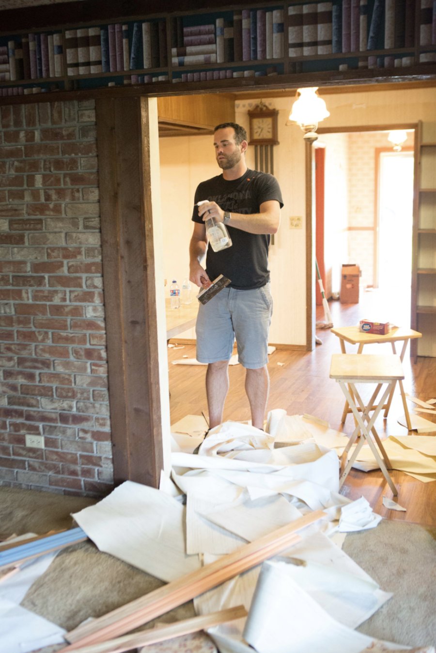
It’s unbelievable to me now when I look at these photos that this is the same room! Knocking out the brick wall which used to be the original exterior of the wall, was no easy task. It also wasn’t an easy task convincing Mike Miller to go for it – ha! But I definitely think it was the right decision. Especially when you see these before and afters of how the bricked wall completely closed off the kitchen from the living room.
THE LIGHTING:
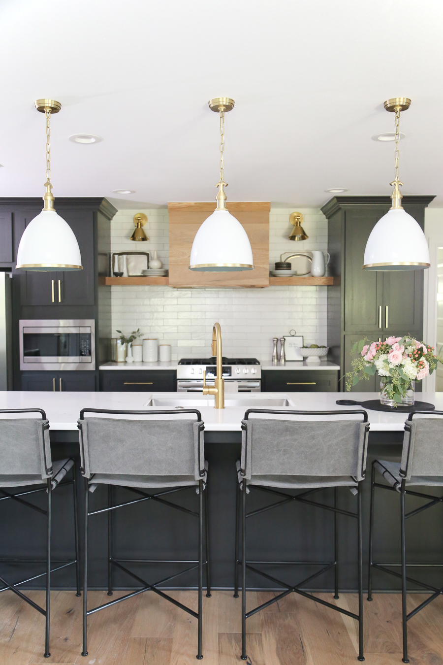
All of the lighting in the flip is from HUDSON VALLEY LIGHTING. We absolutely love working with them and use HVL in all of our products. CC and MIKE THE SHOP also proudly offer Hudson Valley Lighting in our SHOP and here are some of our favorites:
SCROLL AND TAP TO SHOP HUDSON VALLEY LIGHTING FAVORITES:

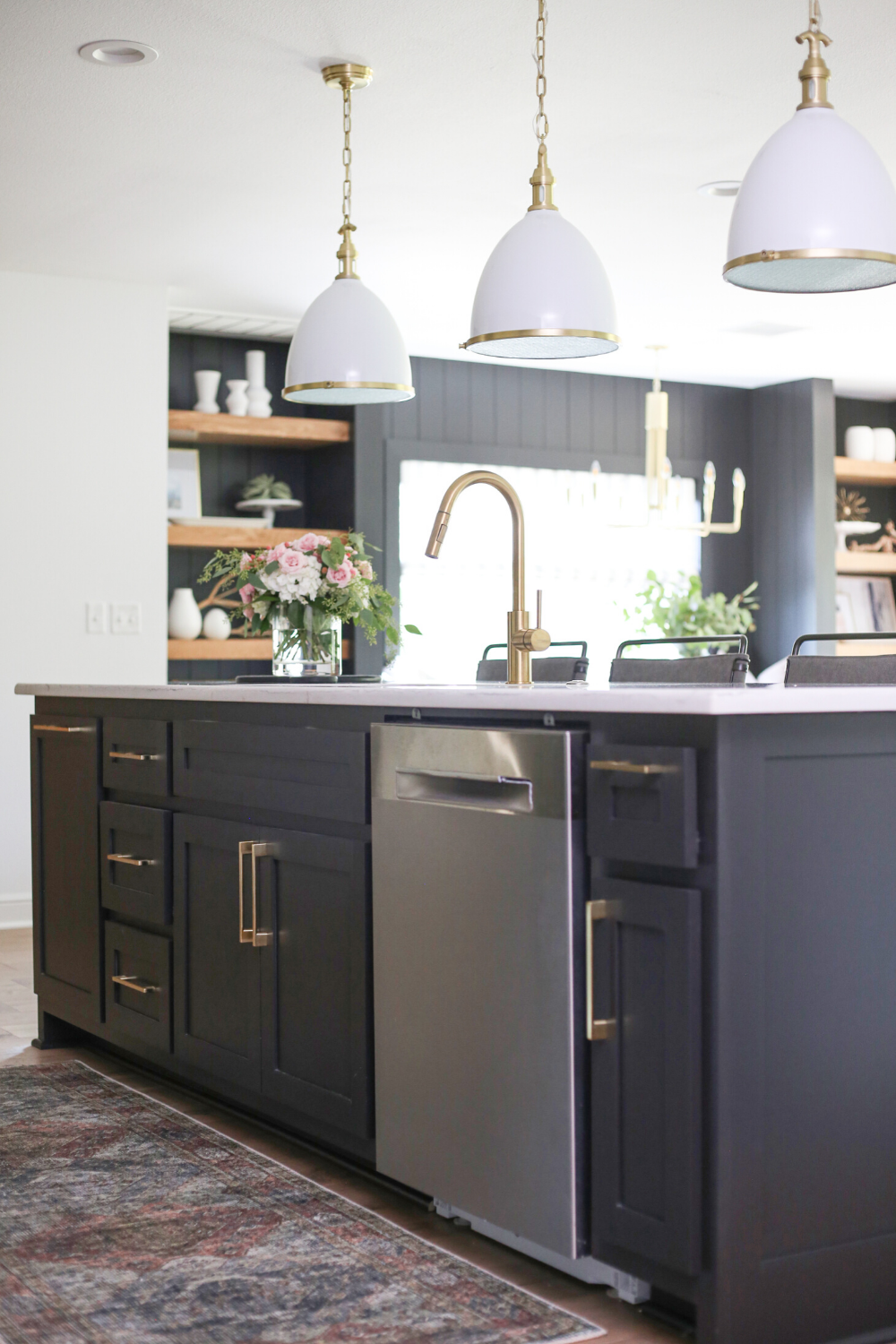
APRICOT MIST SKY KITCHEN RUNNER – we love this runner and the beautiful colors and patterns. It makes a statement wherever it goes and we love how it looks in the flip house kitchen!
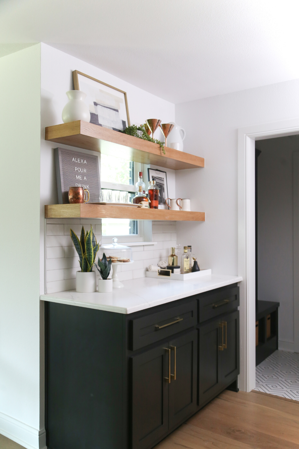
BELOW you will see the original laundry room of the house. One of the major things we did with the kitchen remodel is to knock into the garage and frame out a new laundry room, making the original laundry room a part of the new kitchen. We made it into a bar area with open shelving in front of the window and it made the kitchen much larger and more functional!
SHOP THIS LOOK

PANTRY
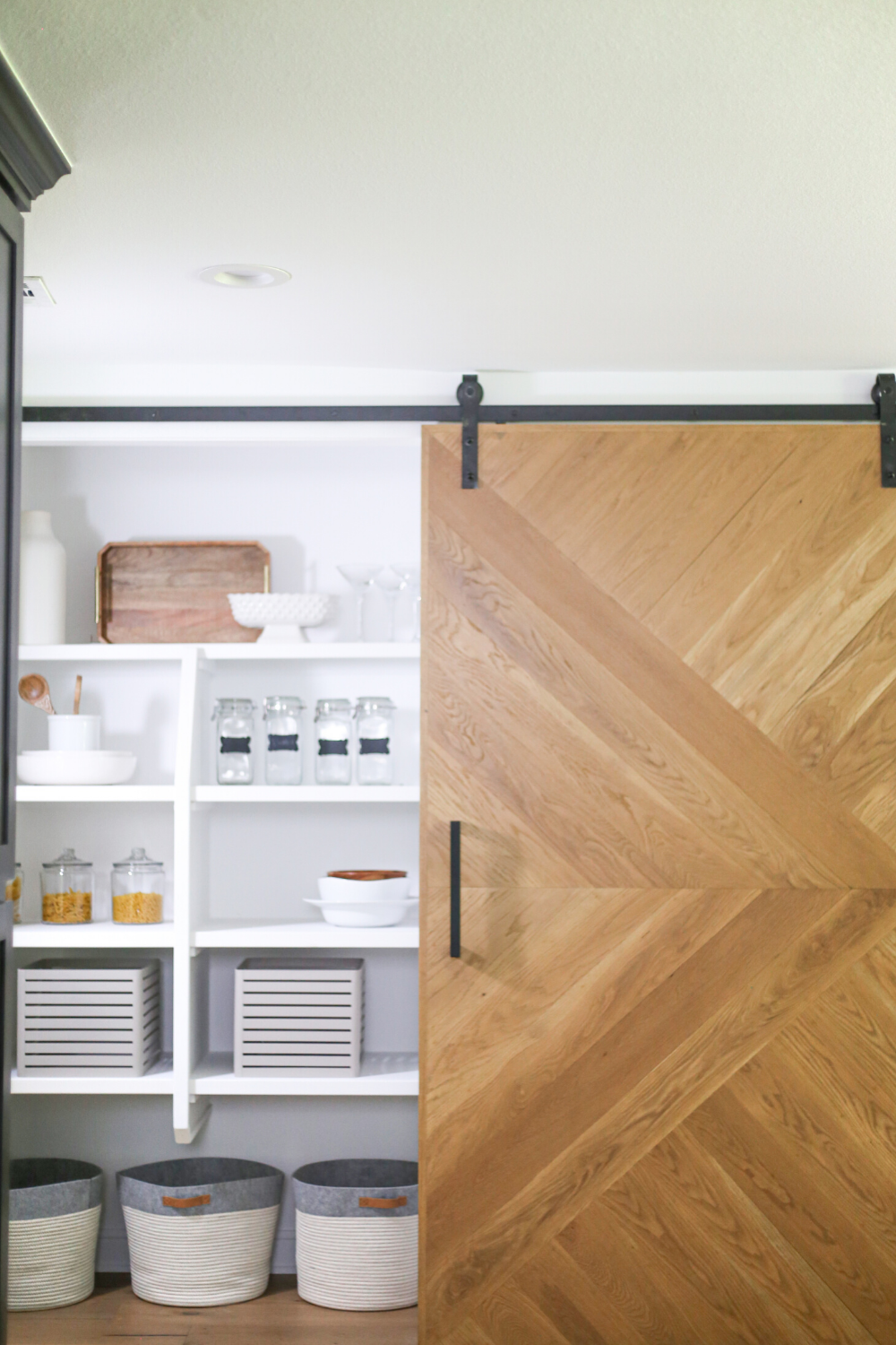
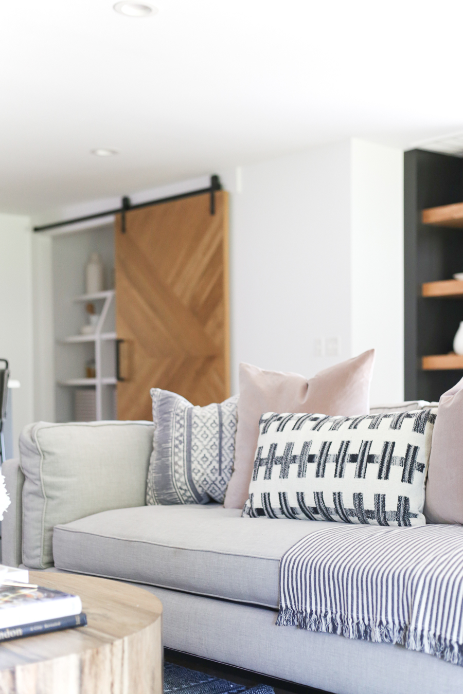
The original pantry door was pretty small and had a lot of hidden space around the corner. But it wasn’t accessible and the design was awkward. I knew that we needed to make the wall into a design statement. We came up with the idea of the sliding barn door to accomplish that. Mike is more function and I am most definitely fashion, so this pantry has the best of both worlds now. The large pantry is fully accessible and is one of my favorite features in the home.
WOOD FLOORS, TILE, AND BACKSPLASH:
We were so thrilled to work with MILL CREEK CARPET AND TILE for our flooring and backsplash in the kitchen. One of the most beautiful items in the entire house is the Bella Cera engineered wood floors that we put throughout the house. Mill Creek has all our favorite design selections saved so you can just go in and ask for the CC and Mike Special and they will get you taken care of!
Kitchen Backsplash is available locally at Mill Creek Carpet and Tile – Eden Bianco 3 x 11 | If you aren’t local to Tulsa you can buy this Ceramic Subway Tile to recreate our backsplash look
Now for the TILE – We used two different tiles, both available at Mill Creek Tile locally in Tulsa. If you aren’t local to Tulsa, I’ve sourced the black and white plaid, and black and white geometric line tile for you here:

LIVING ROOM
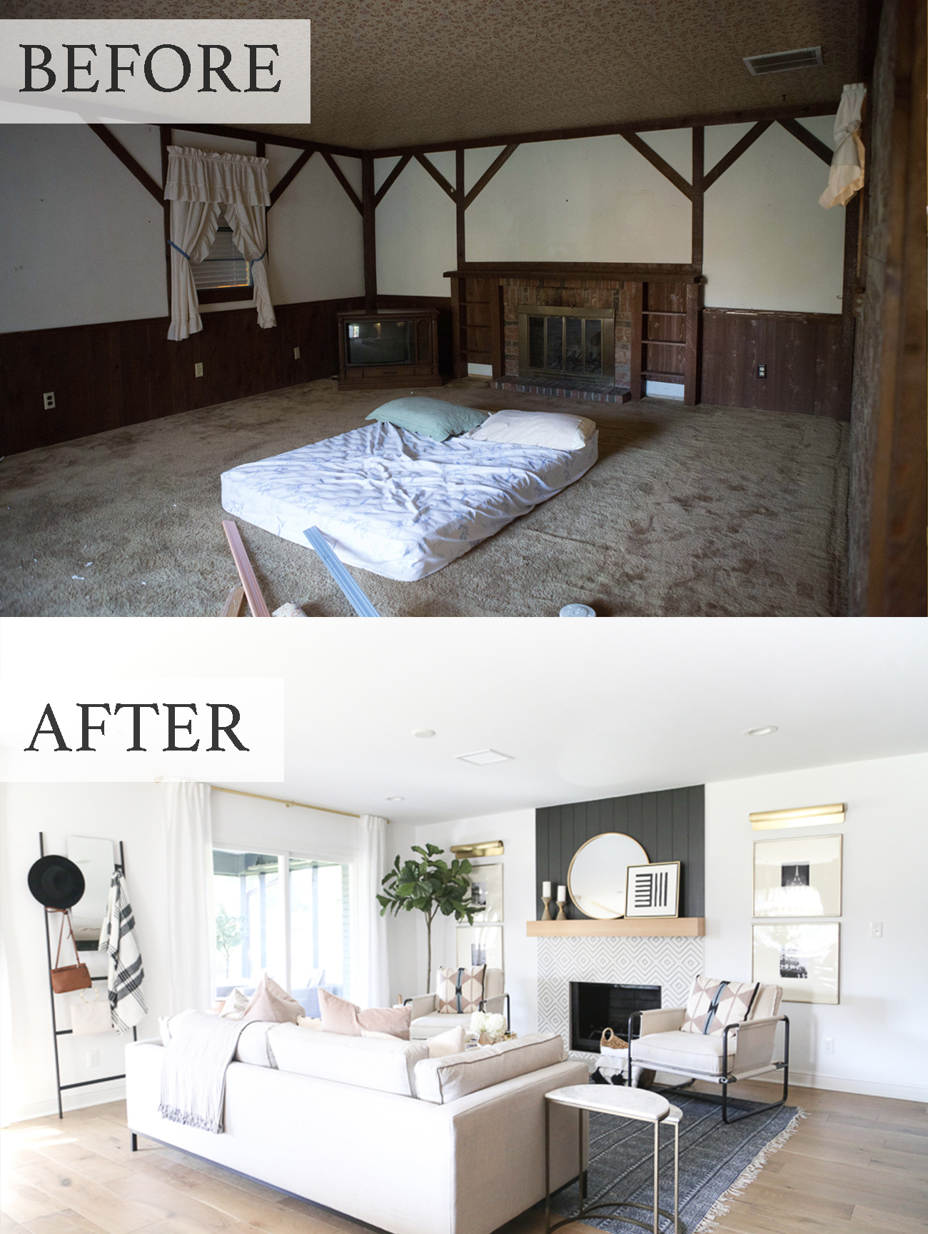
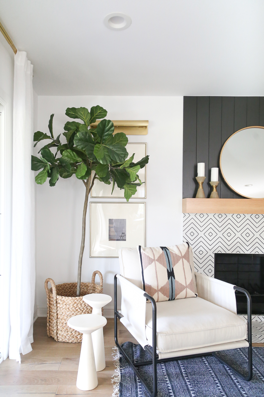
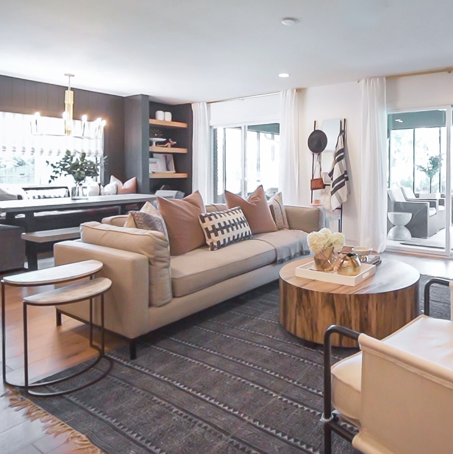
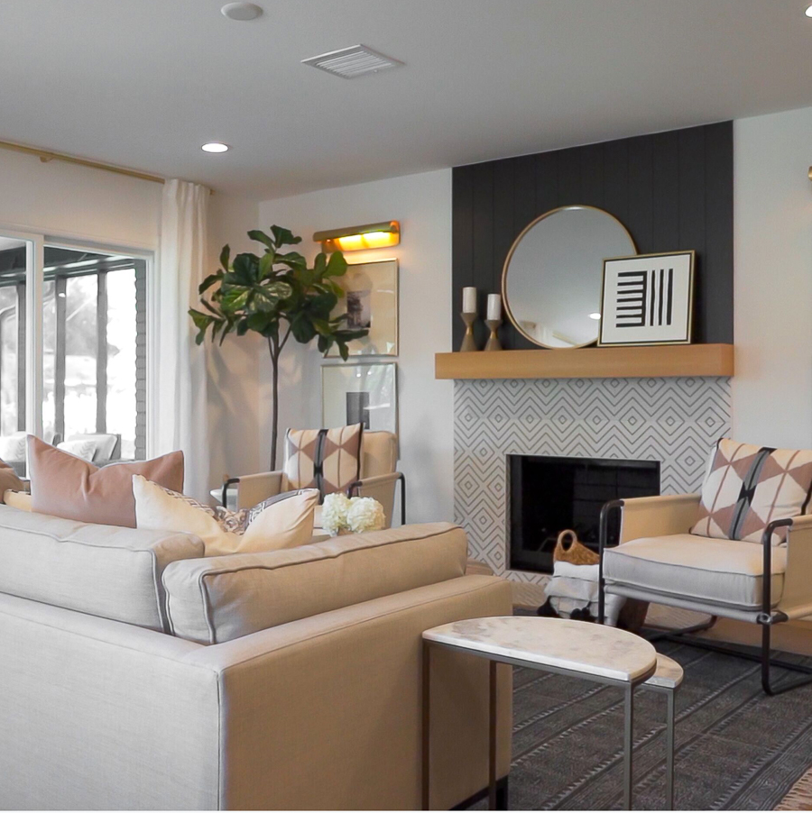
I’ll let the before and afters do the talking for the living. I will mention that I think the fireplace redo is one of my favorite statements in the room!
RECREATE THIS LOOK:
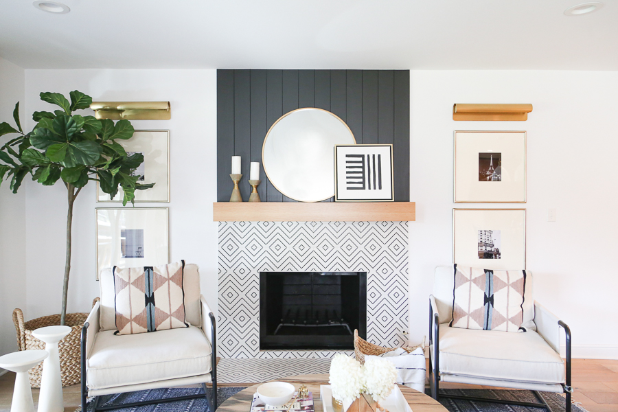
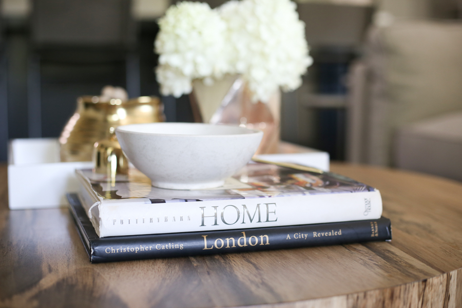
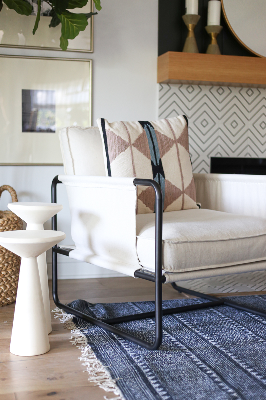
Indigo Rug | Gramercy Sofa | Chair | Gallery Frames | Art for Gallery Frames – from CC and Mike THE SHOP Print Shop | Library Lights | Fiddle leaf fig tree and Basket | Mirror | Coffee table | Wall Shelf and Mirror | Linen Drapes and Hardware | Nesting Tables | Christie Adelle art | Patterned Chair Pillows | Cera Pillows | Mauve Velvet Pillows
SHOP THIS ROOM:

THE SOFA AND CHAIRS:
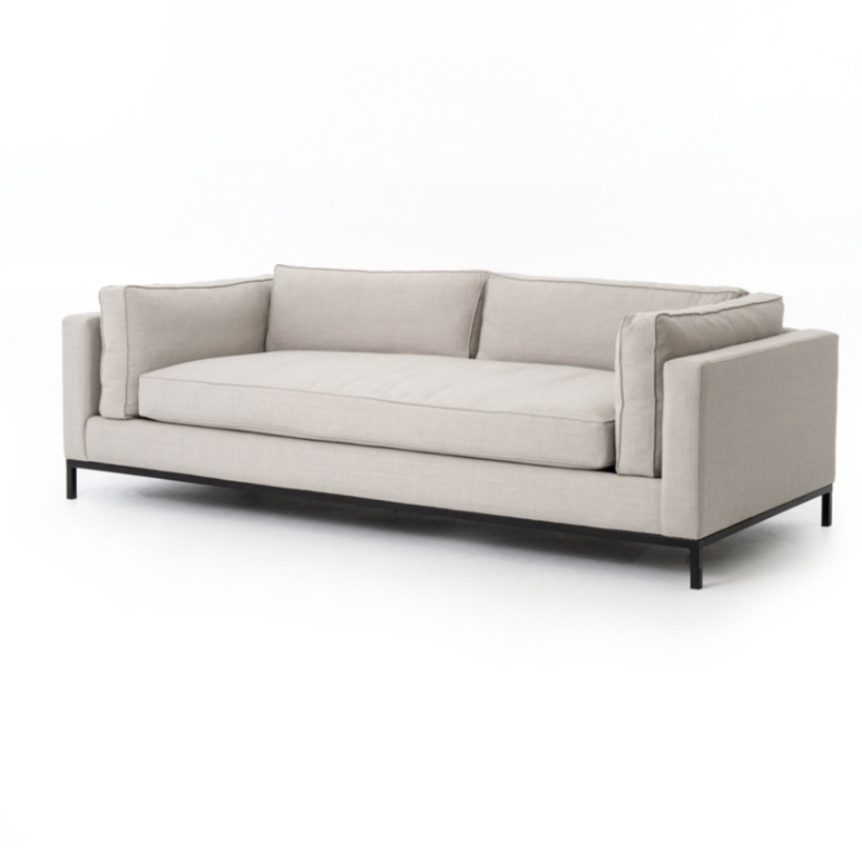
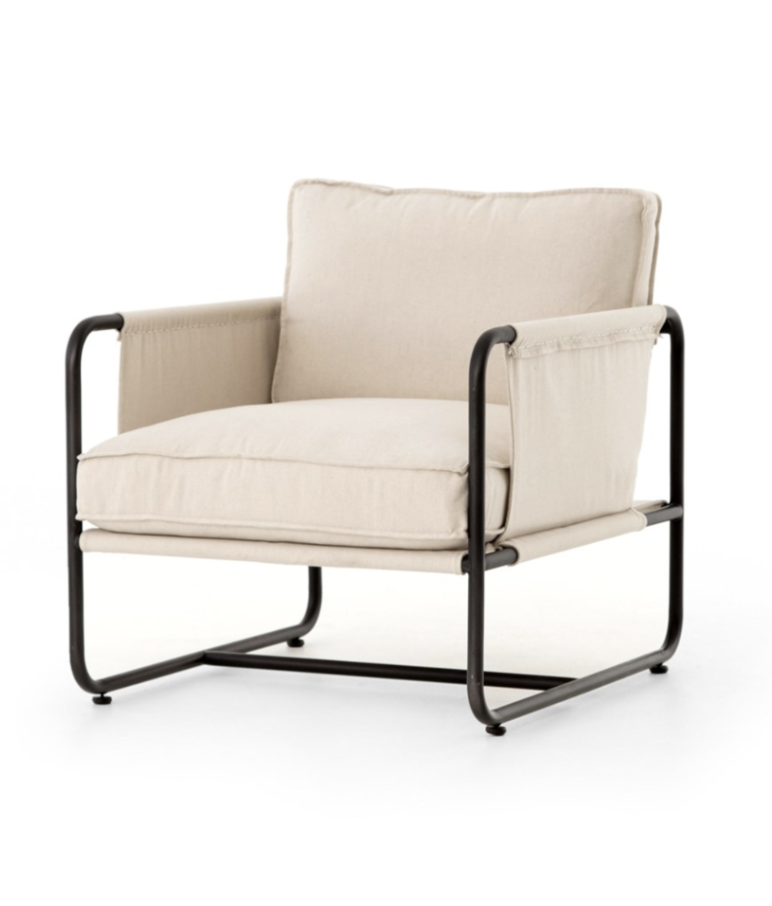
If you are looking for a great, clean-lined couch for your living. We highly recommend the Gramercy sofa from CC and Mike THE SHOP. It pairs beautifully with the Isabel chairs and Hudson coffee table for a beautiful living room feel!
 THE ISABEL CHAIR
DINING ROOM
One of the biggest problems that needed fixing in the ranch-style house, once we opened up the kitchen and knocked out the brick wall, was that there was no dining room. My idea was to do a built-in breakfast nook on the back wall of the living room and turn that space into the dining area. It was a great use of space and turned an otherwise boring wall into a bold statement with a functional use as a dining area!
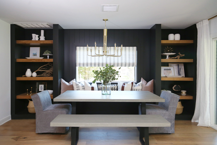
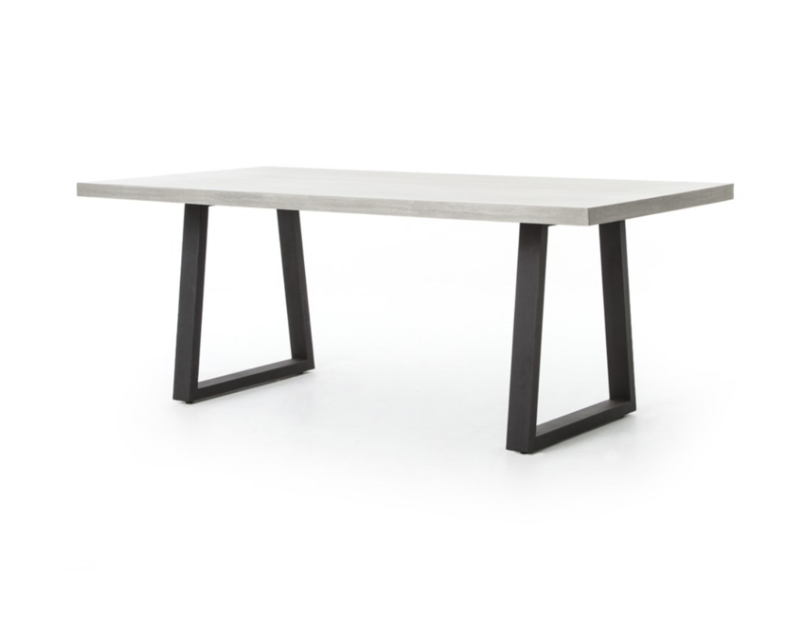
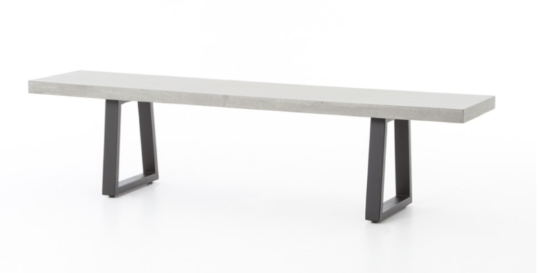
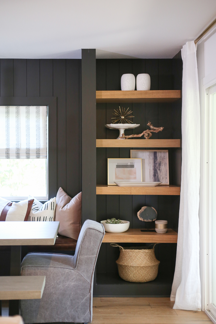
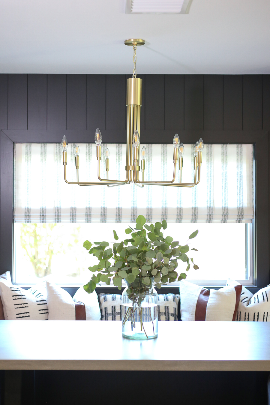
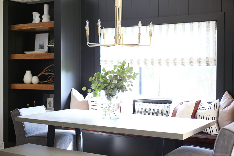
If you are looking to style bookshelves in your home like we did in the Jenks flip house dining room, check out the new CC and Mike the SHOP line of HOME ACCENTS. We just added all of these items to the shop because we think that they are perfect for bookshelf styling!!
SCROLL AND TAP TO STYLE YOUR BOOKSHELVES WITH CC AND MIKE HOME ACCENTS:

THE MASTER BATHROOM
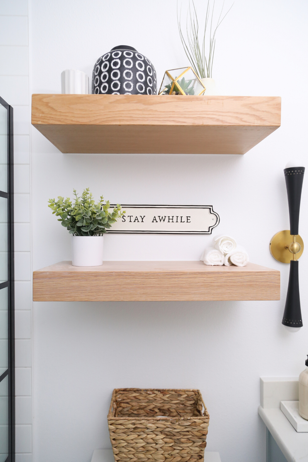
Without a doubt, one of the most dramatic changes we made in this flip house, is turning this peach and floral wallpaper CLOSET, into an awesome MASTER BATHROOM! When I walked into this house, I had a vision of what I wanted to do with outdated ranch style home. I immediately saw the potential. Originally, this home only had three bedrooms and one bathroom. It now has three bedrooms and TWO bathrooms! We literally took a tiny, wallpaper filled closet and converted it into the master bathroom. It is the thing that I am the proudest of, on this project. It was a big deal to add this room but it was paramount to the design of this house.
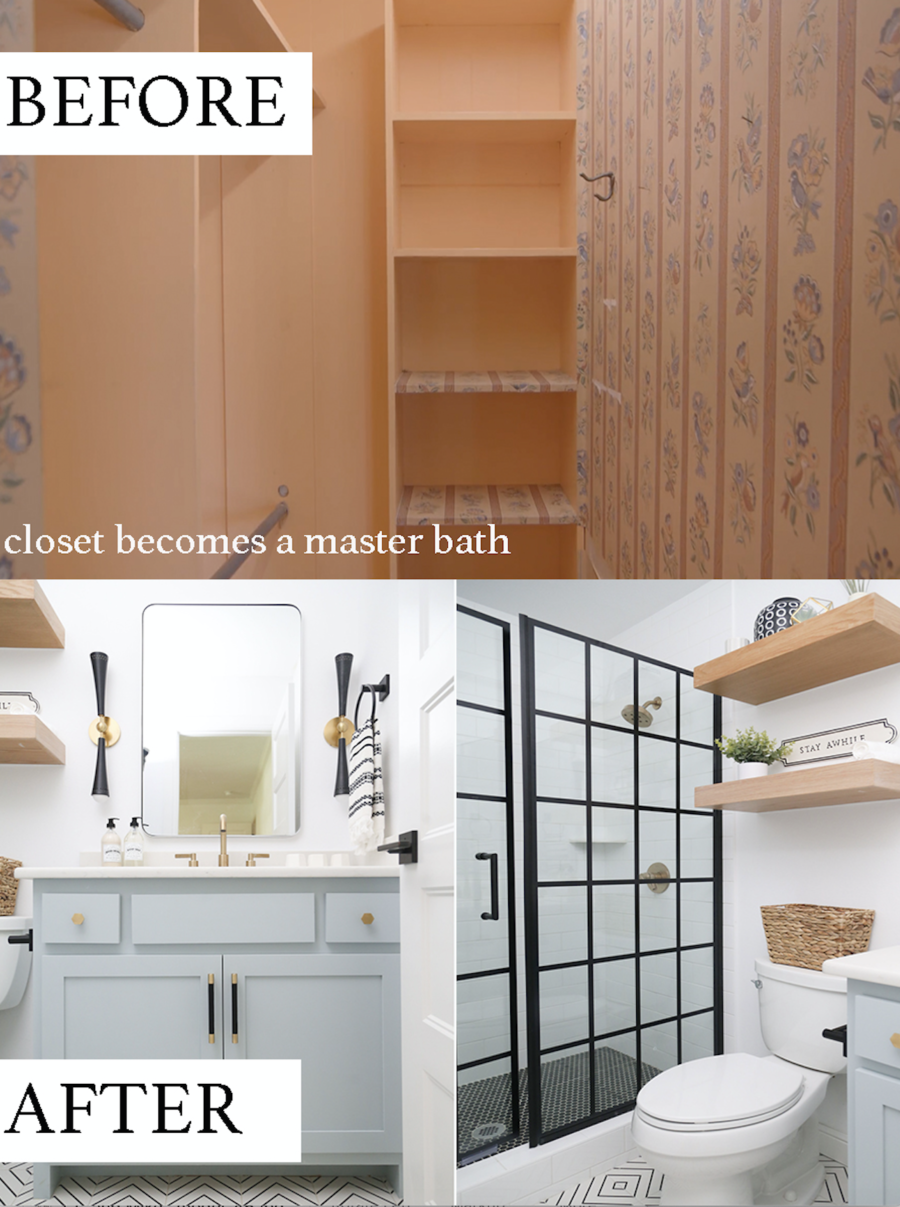
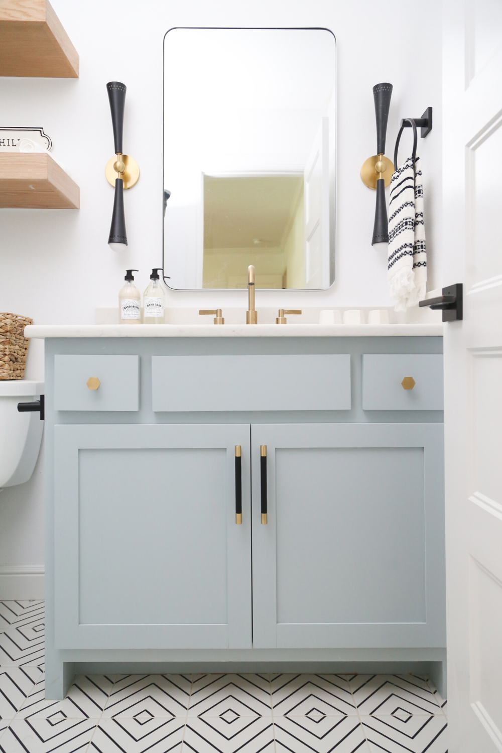
RECREATE THIS LOOK:
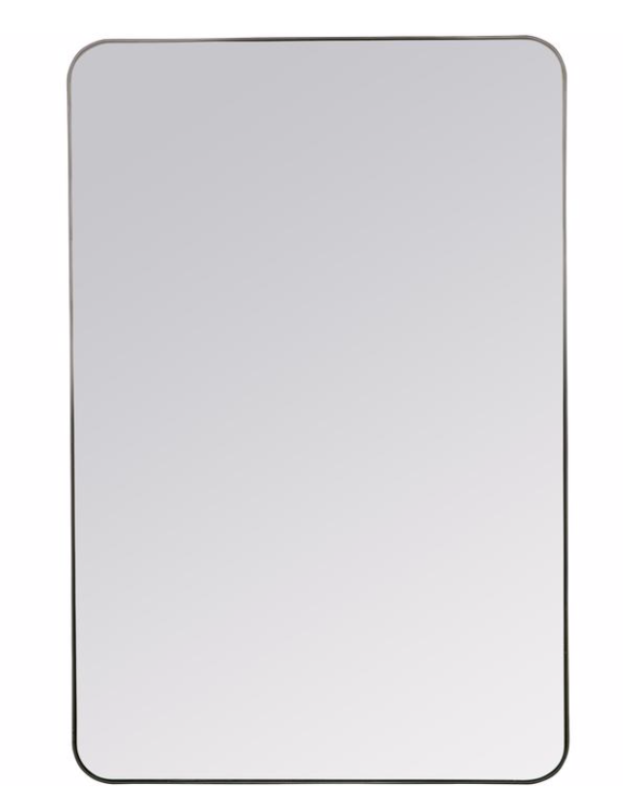
FRANCO MIRROR | TUPELO WALL SCONCES | GOLD BATHROOM FAUCETS | OPEN SHELVING | SHOWER DOORS
PAINT COLORS: Wall color is Decorator’s White by Benjamin Moore and Cabinet Color is Smoke by Sherwin Williams
TILE:

HARDWARE:

SHOP THE ROOM:

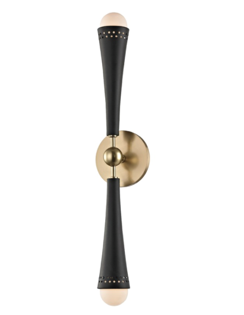
– THE FRANCO MIRROR AND TUPELO SCONCE
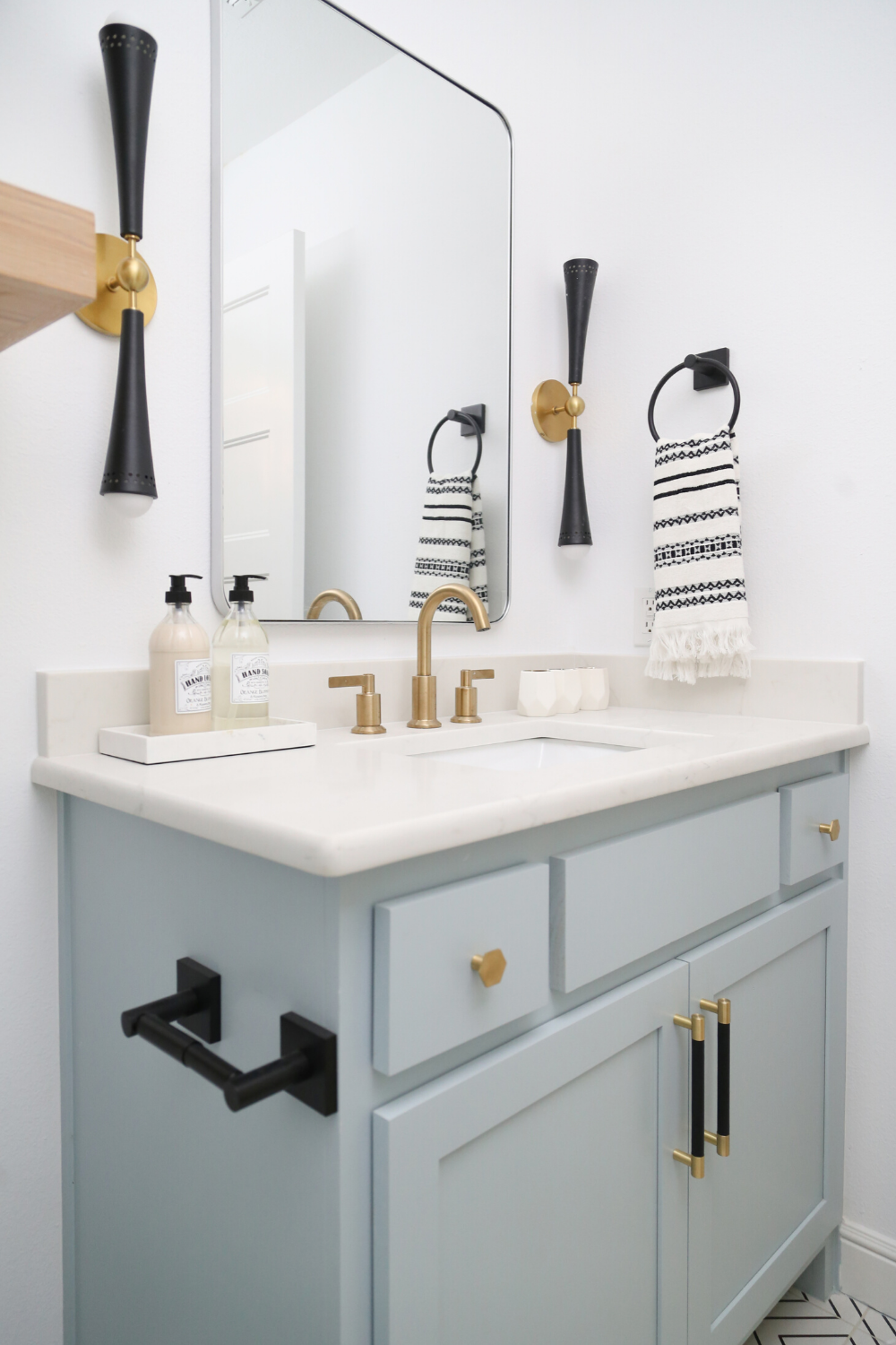
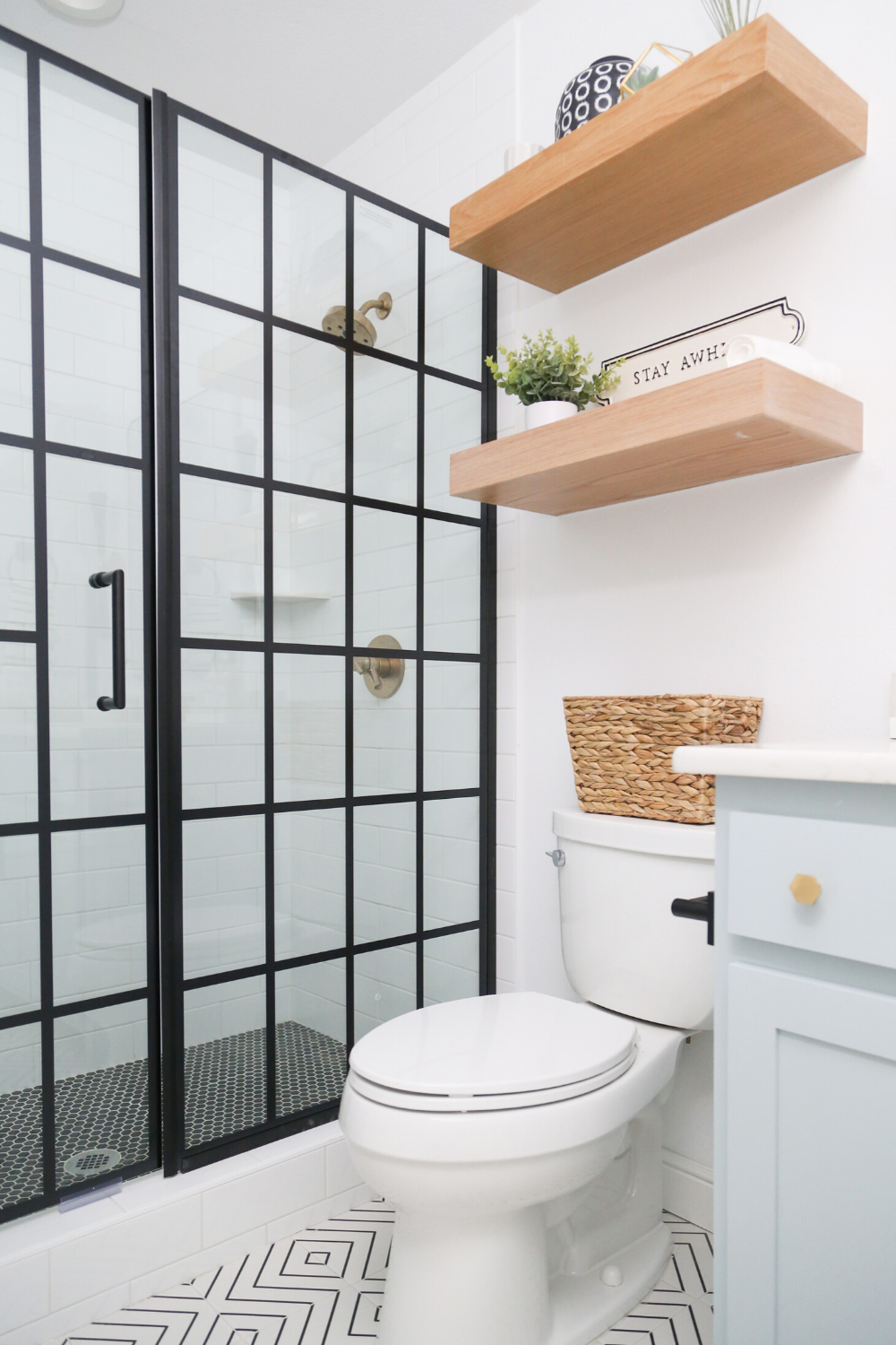
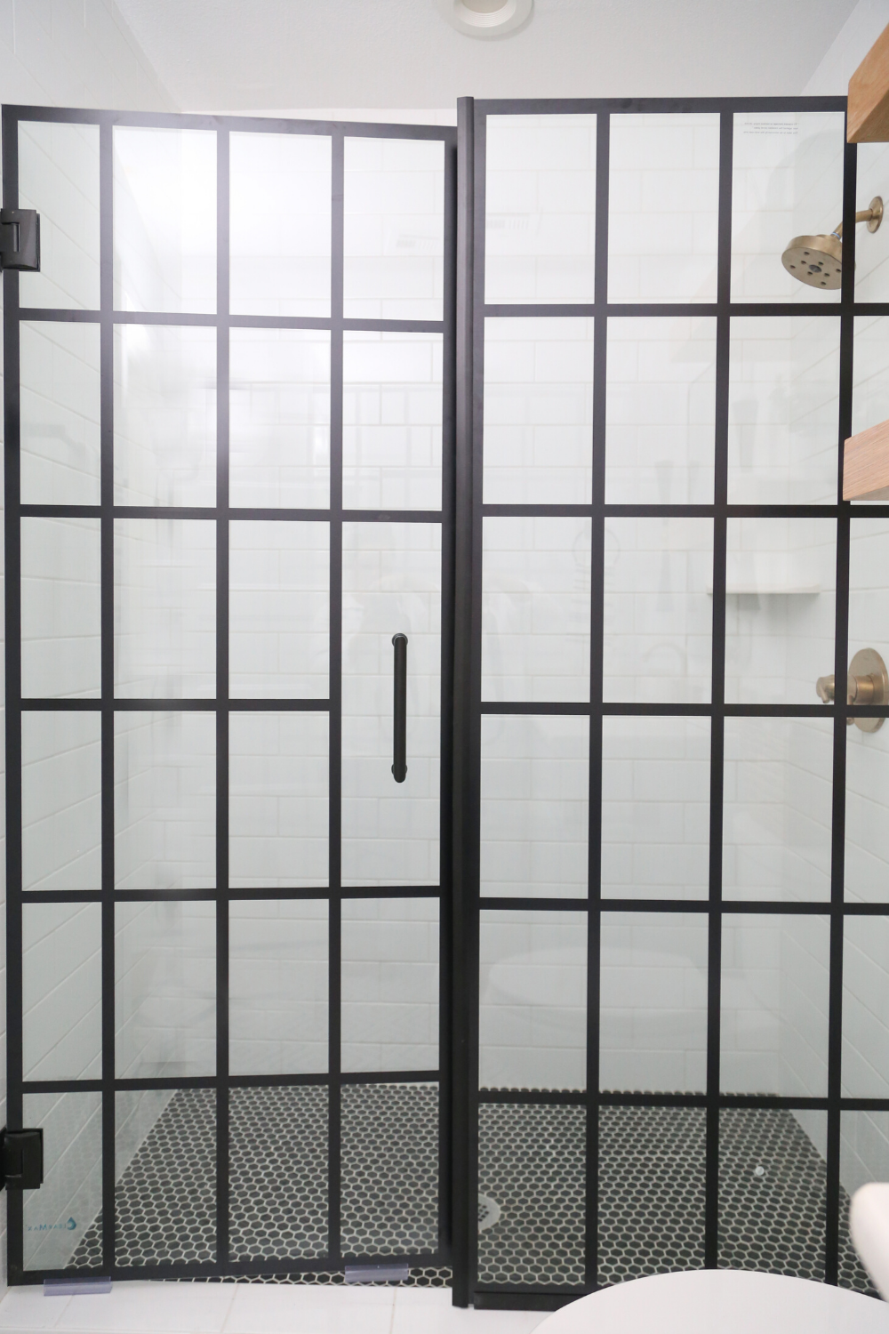
One of the best features of this master bathroom is the SHOWER DOOR that we sourced from Home Depot. These window pane shower doors are so on trend and we love them paired with the black and white geometric line tile floors, blue/gray cabinet color, and black and gold hardware!
SHOP OUR SHOWER DOOR HERE:

OK so it’s not fair to talk about our master bathroom addition and not give the original bathroom some love as well. This bathroom was once the only bathroom in the house but with our renovation, it became the hallway bath for guests and also fo the two bedrooms to share. We kept with the same palette but switched up the floor, mirror, and sconces:
RECREATE THIS LOOK:

Last but not least in theCC and Mike Modern Navy and Cedar Ranch Style Remodel Reveal, I want to show you just a few more before and afters. Because who doesn’t love a before and after!
THE FRONT ENTRY
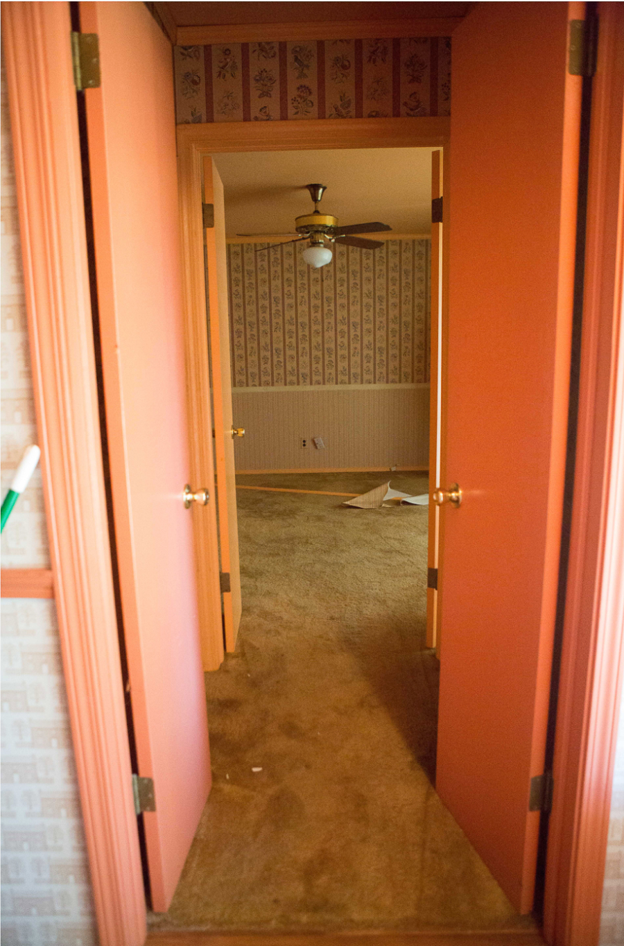
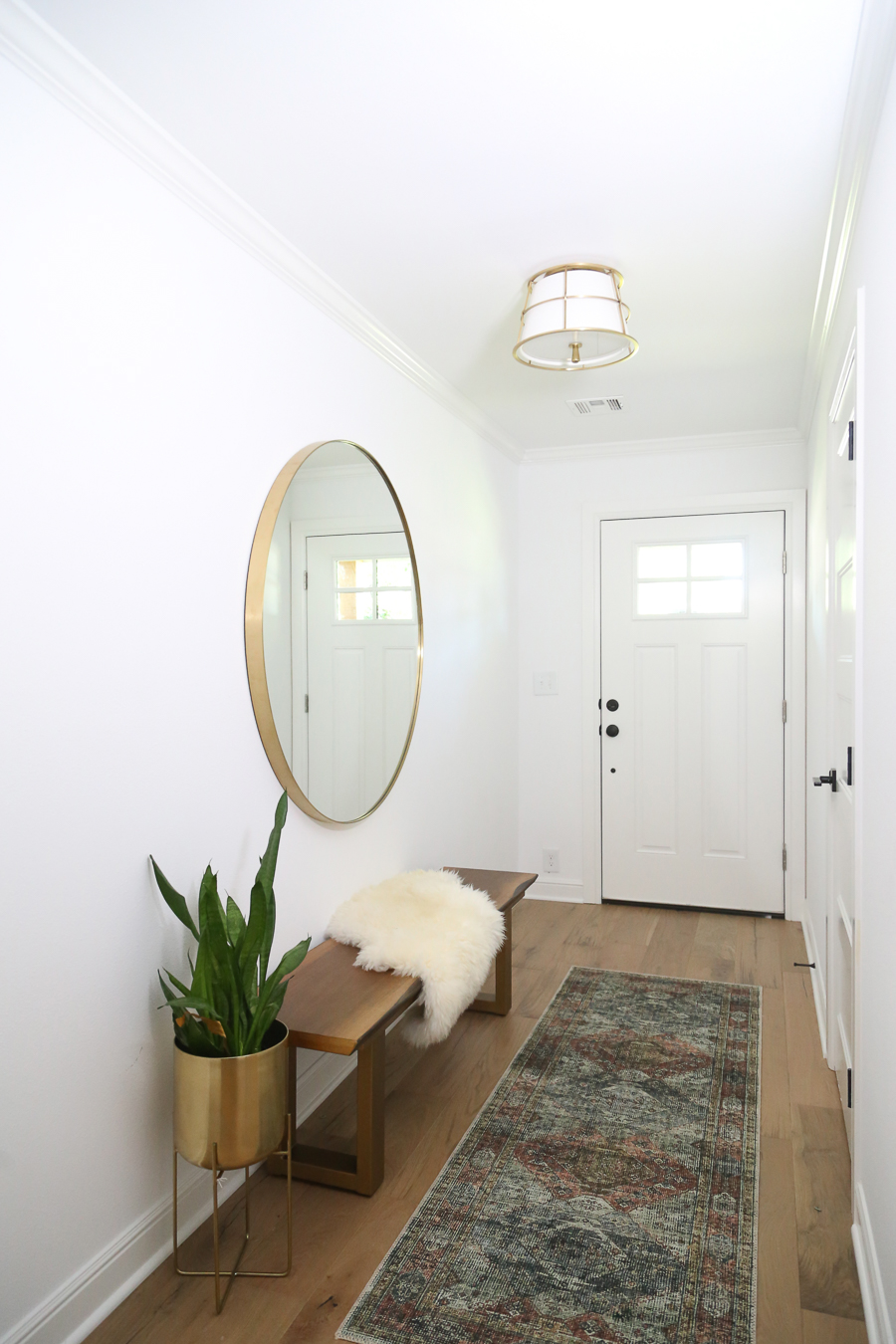
In the original home, when you walked in the front door, there were two double doors that led into the closet area (that we turned into the master bath) and what I’m assuming was the original living room. This had been converted into a master bedroom over the years but had no bathroom. We walled off these doors, turned the closet into the master bathroom, and turned the original living room in the master suite. We knocked a wall out in the kitchen and framed into the garage then made an entrance into the master suite off the kitchen.
SHOP THIS FRONT ENTRY LOOK:


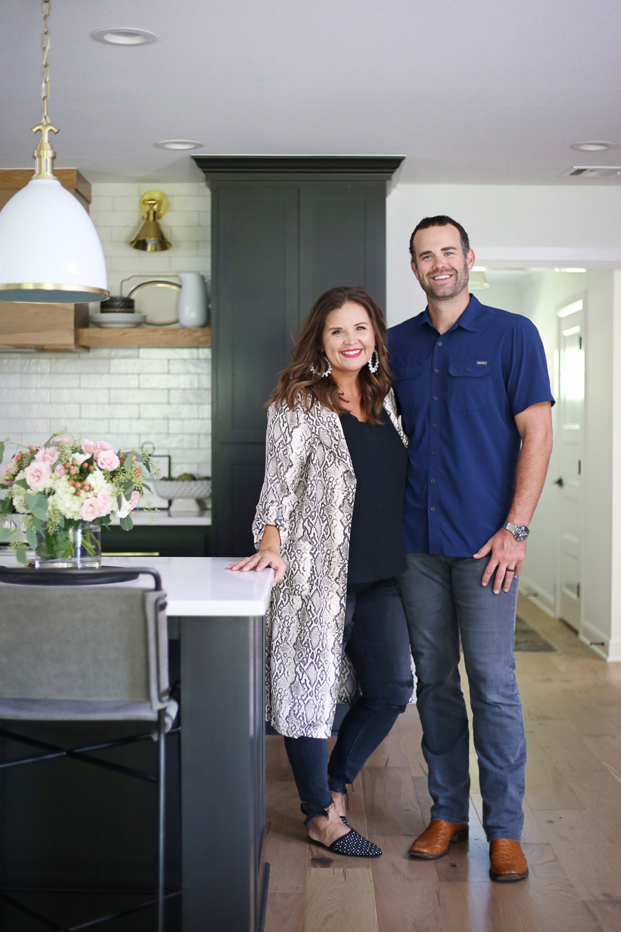
I’ll leave you with some pretty little details. This project was a long time coming but we loved the journey. From HGTV coming to film and choosing not to come back and finish the pilot, to us letting it sit for a year while we finished the Good Remodel and Rebsamen Remodels, to us meeting Dorothy and finding the absolute perfect buyers meant for this home…I wouldn’t change a thing.
I hope you enjoy the CC and Mike Modern Navy and Cedar Ranch Style Remodel!
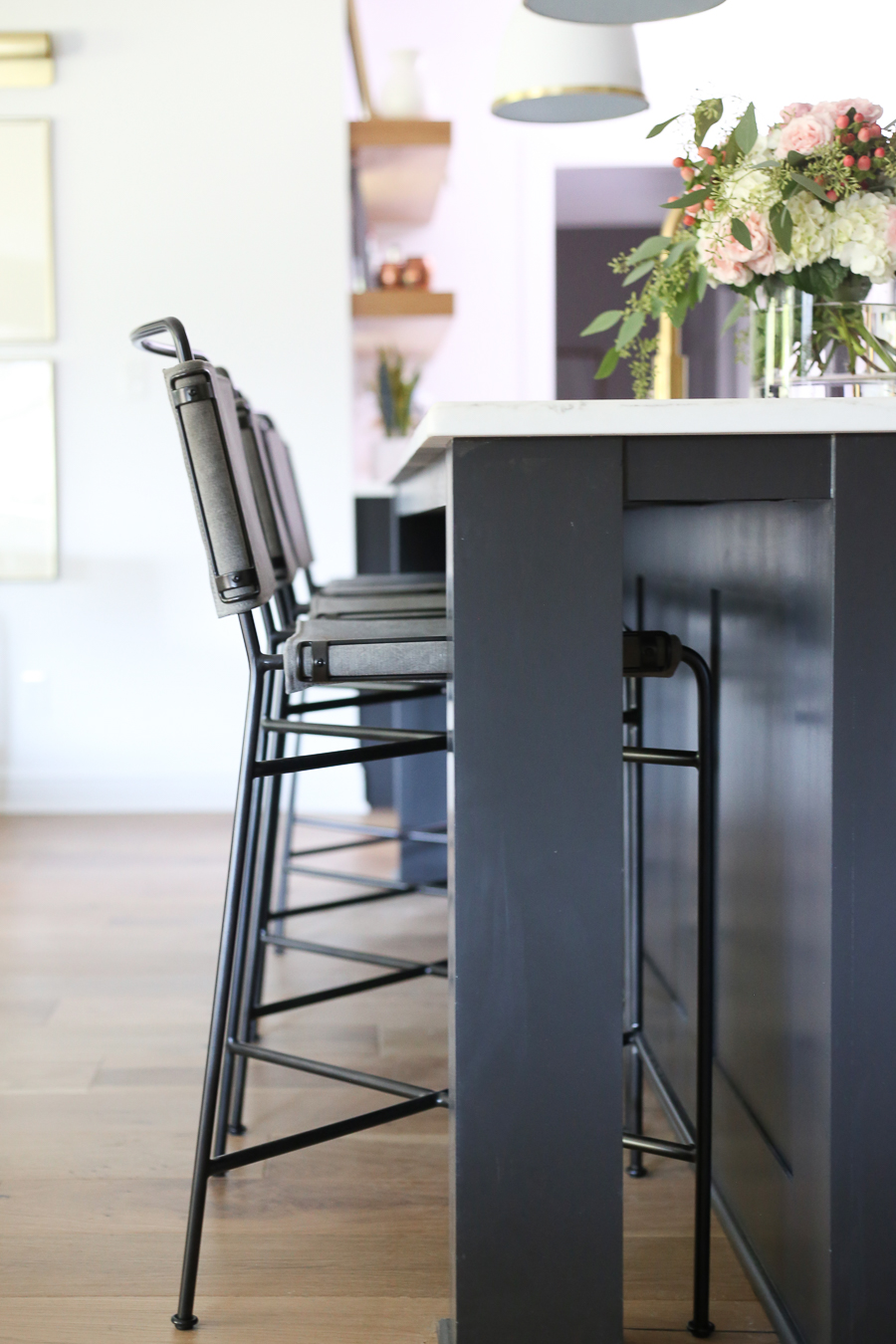
We are so thrilled to be a part of this transformation and to update this home for the next generation to make a lifetime full of memories inside these walls and in that big, gorgeous backyard just like the generation before them did.
EVERY HOME HAS A STORY. We are honored to be a part of this story.
\

