Sharing is caring!
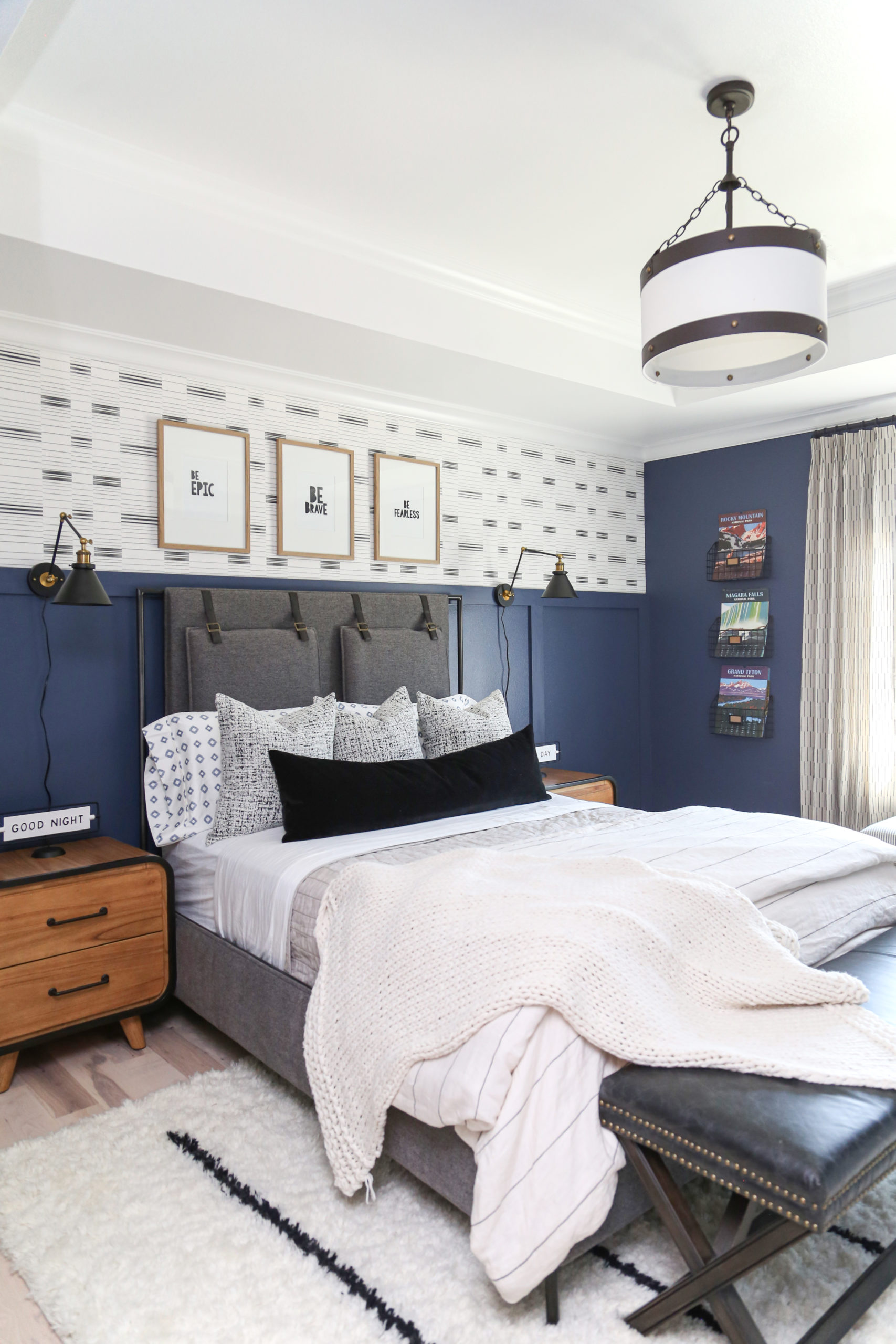
Hey everyone! If you have been following CC+Mike, you’ll know that I’ve been super excited to share some of our recent projects with you all. Today’s the day! After all our hard work we are ready to reveal Cohen’s new bedroom design. During the lockdown last spring, I got sick and tired of my boys’ bedrooms being an absolute disaster. No, seriously, they were tragic, you guys. Since my boys’ rooms were upstairs, I’ve had an “out of sight out of mind” mentality ever since we moved in. Once we were under stay at home orders, I just couldn’t take it anymore! I finally broke out the paintbrush and started the process of redoing Cohen’s bedroom. In this post I’ll be sharing more about the design process and all of the exciting changes we made in this teen bedroom reveal!
Before and After: Teen Bedroom Edition
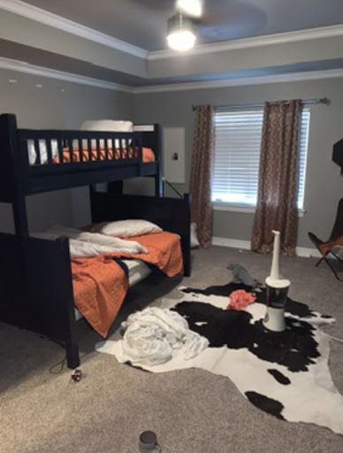
I feel like you guys aren’t going to believe me when I say that Cohen’s room was in pretty sad shape before we redid it. Someone once said, “A plumber’s toilet is always clogged.” I got a kick out of that because I think I would add to it that “A designer’s house is never decorated” — ok so it is decorated somewhat but it is never done. And the boys rooms were definitely in an unfinished state! They’d stayed the same for the first four years we lived in the house. So without further ado….HERE is Cohen’s bedroom before.
BEFORE
AFTER
Quite a difference don’t you think?! Here is how we went about making the changes that make Cohen’s room his own!

The Beauty of a Blank Slate
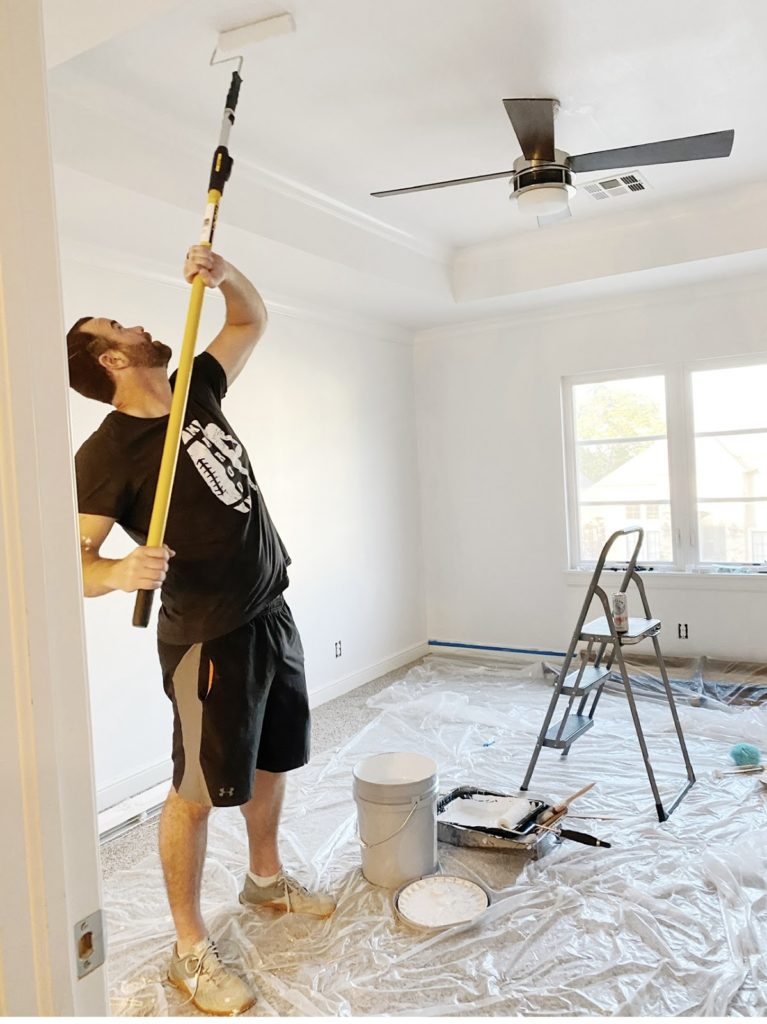
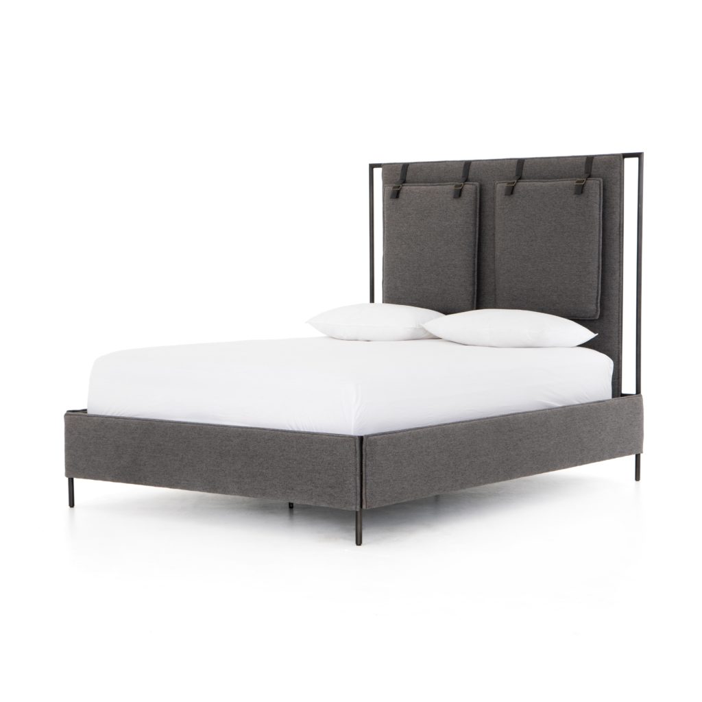
To start the room renovation we painted the whole room white. This might seem like a funny middle step, but it really helped to clear my head. After seeing the room with grey walls for so long it was harder to picture the possibilities. White walls can help you see all of the potential! Along with that, I changed out the base elements of the room – particularly the bed. Teenagers usually like to have a larger bed and I wanted to find the right option for Cohen. The Leigh upholstered bed featured in CC+Mike: The Shop turned out to be perfect! It’s masculine and modern but still soft. I paired that with some fresh bedding and kept things very simple for a while.
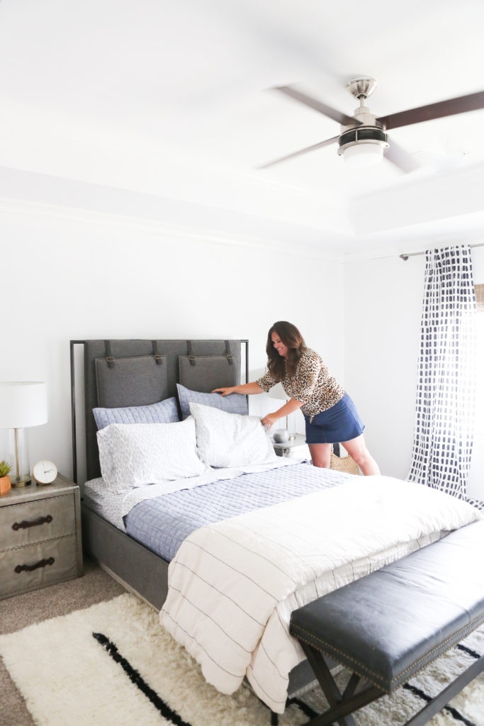
But the thing was, this bedroom look just wasn’t Cohen yet. Cohen is bold, passionate, and charismatic, so his bedroom design needed to match that. After all, painting it white was just the first step to get the ball rolling! From there we came up with a new plan to fit his unique style.
SCROLL AND TAP TO SHOP COHEN’S BEDROOM FURNITURE AND RUG

Teen Bedroom from Design to Completion
If you’ve seen other CC+Mike design posts you’ll know that I love creating design boards! I use them for all of my projects, whether I am working with a client or redesigning my own home. They are perfect if you are a very visual person, like me. Design boards let me mix and match elements before I get them in the room! Here is what the design board looked like for Cohen’s room.
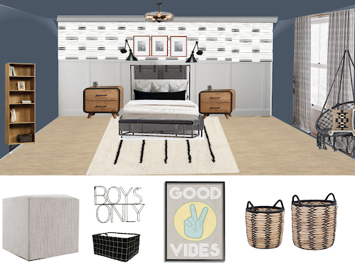
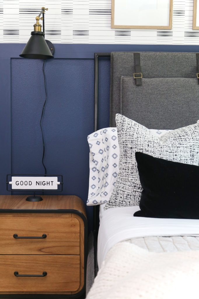
The first thing you’ll notice is that the walls are no longer white! I decided to create an accent wall with the Dashing Stripe Wallpaper from CC+Mike: The Shop and some beautiful wainscoting. It’s BOLD and original just like Cohen! And we paired it with an equally bold paint color to really set the room off. Navy is one of my favorite colors to design with. This Benjamin Moore Newbury Port blue has just a bit more kick. If you want a bold blue but want something a bit more vibrant than Hale Navy, Newbury Port Blue by Benjamin Moore is the color for you!
Once we had the perfect paint color, I played with the accent pieces until I found the right look. They do say the devil is in the details! Even during this design phase I was getting more and more excited to share this teen bedroom reveal with you!

Make it Match His Personality! Accentuating Cohen’s Style
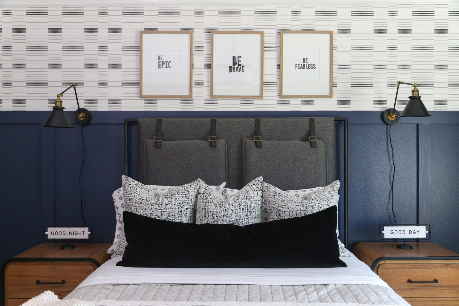
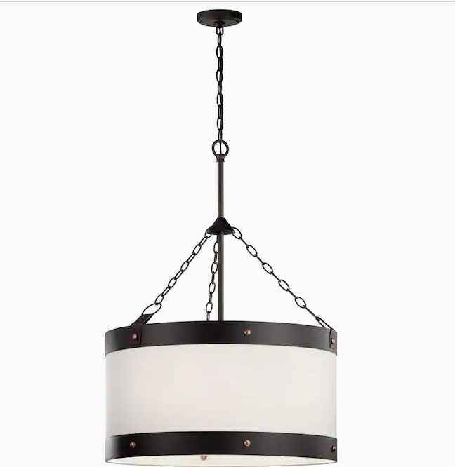
Finding the perfect bed was one of the first steps to making this room shine. The Leigh bed is the perfect focal point and all of the other pieces we chose just fell into place around it. And no CC+Mike room is complete without one of our gorgeous area rugs! This ivory and black Easton rug feels like it has always belonged there. We also switched out the fan that was originally in the room for the Kichler Rayleigh pendant light from Lowes. It is my new favorite! I’ve used it in three other projects so far.


SCROLL AND TAP TO SHOP COHEN’S Bedding

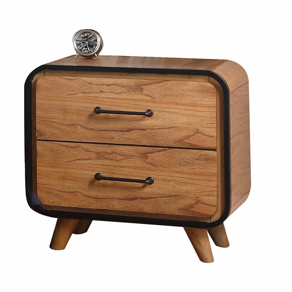
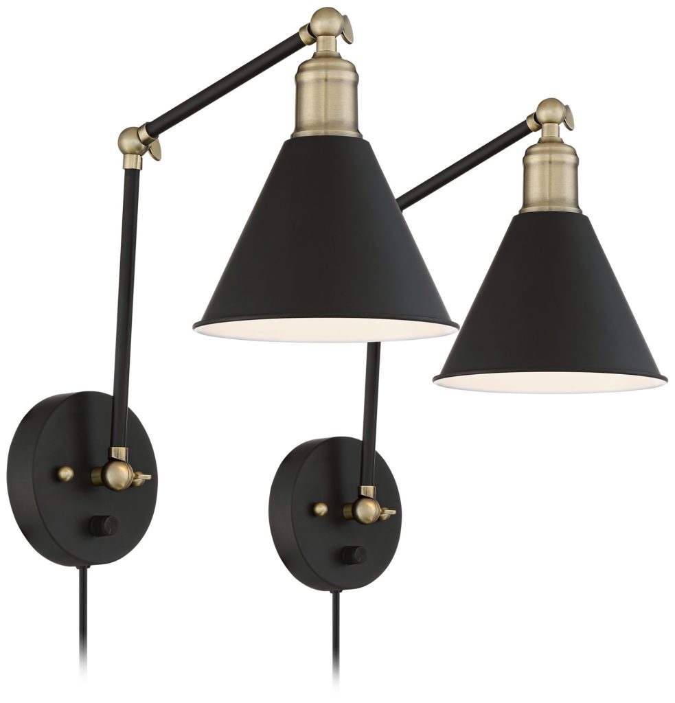
You might also recognize the amazing mid-century modern nightstands from our kid’s bedroom furniture blog post we did with Walmart. I love to feature more affordable items like these in our projects! It shows you don’t have to break the bank to find cool pieces for your design. We also featured the art from Cohen’s room in another post featuring framed art ideas! I love the symmetry it creates, especially with the antique-inspired wall lamps.
I wanted to keep the windows as light as possible. With such a bold color palette I didn’t want the room to feel like a cave during the day. So, I picked these beautiful Teton drapes! They are part of a new custom CC+Mike collection with Honey Pleat. I absolutely love their versatility and how fresh they look. And they look amazing with the wallpaper!
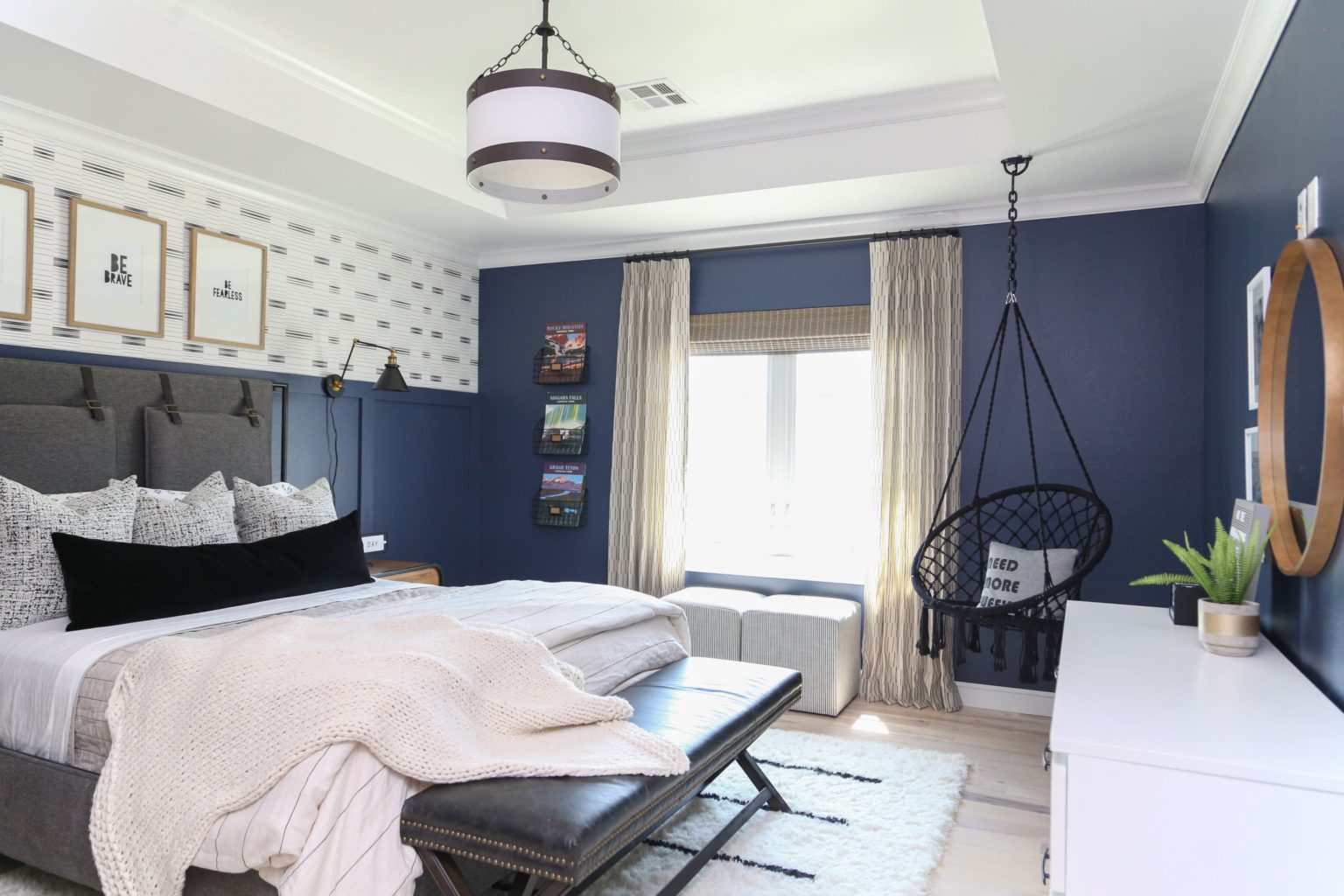
Teen rooms are a great opportunity to use even small nooks and crannies and corners to add meaningful details! On that same wall, I wanted to add something special for Cohen. A lot of our favorite family memories have been made in our RV, traveling around the United States to national parks so I wanted to incorporate that into the room. I put some calendars from our national park travels in these fun wire racks from Walmart. They’re a small reminder of our time as a family that I know he’ll love!
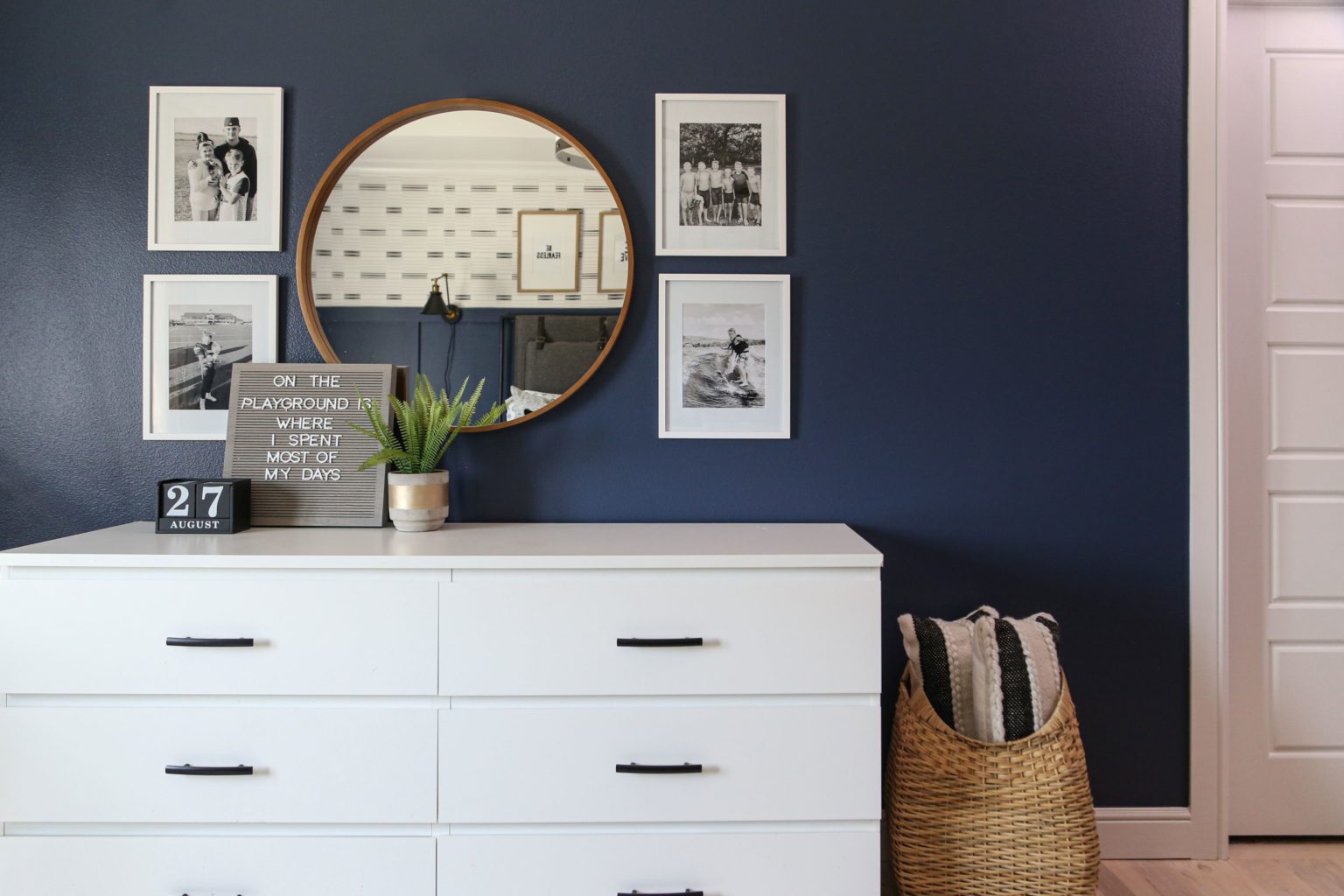
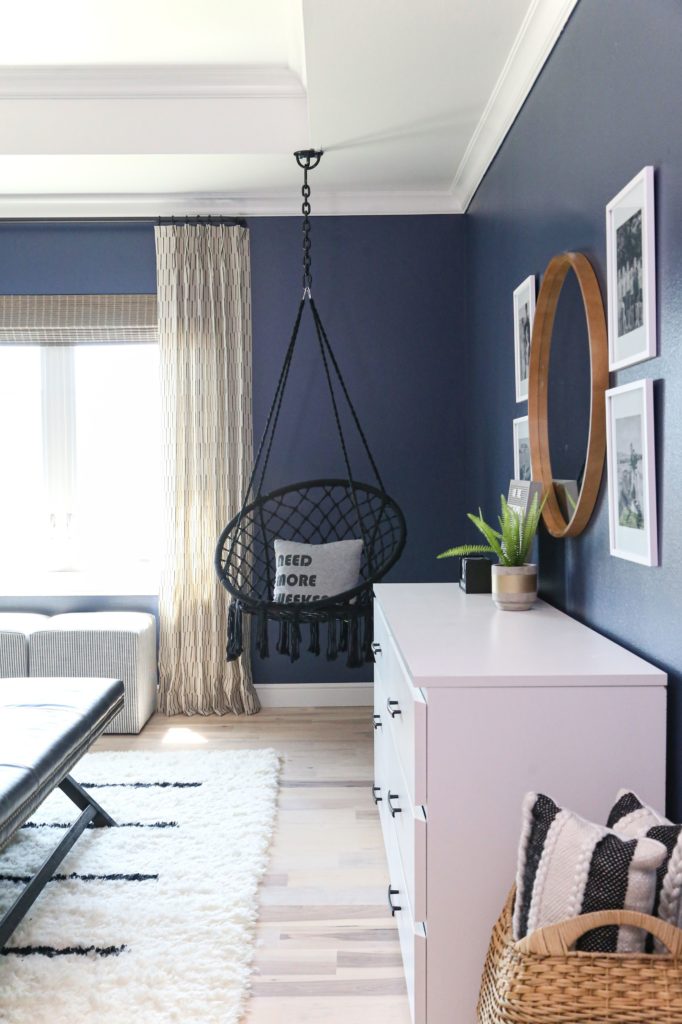
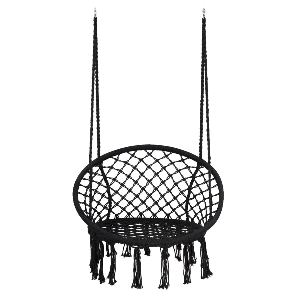
On the wall opposite the bed, I staged Cohen’s dresser with this beautiful Kate and Laurel Hutton round mirror. So cool! I also wanted to feature some fun and youthful seating options in the room. I hung this Gymax hammock chair from Walmart in the corner for Cohen to lounge in! Hanging chairs and egg chairs are some of my favorites to add to a teen bedroom.

SCROLL AND TAP TO SHOP COHEN’S BEDROOM ACCESSORIES AND LIGHTING

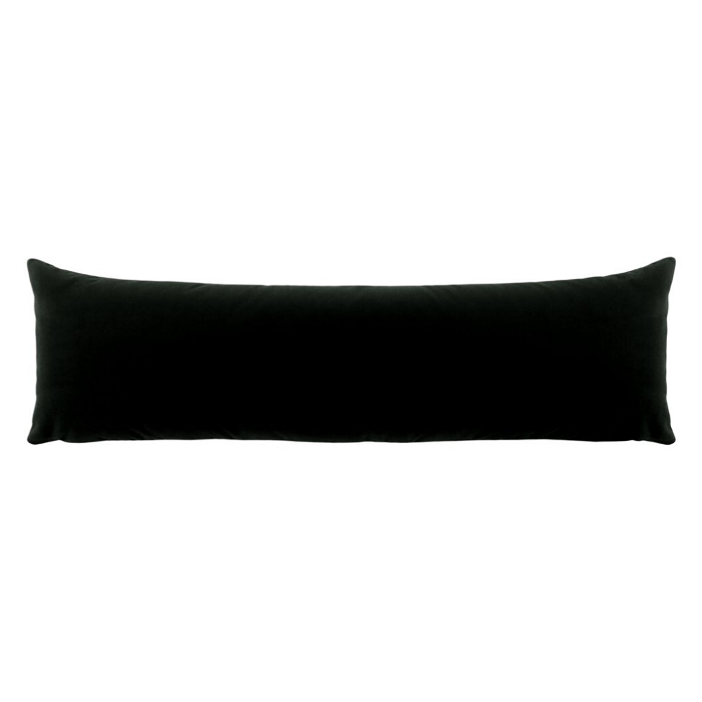
To finish off this amazing space, I added some throw pillows from CC+Mike: The Shop. We used two simple and cool styles: the caviar throws, and the XL mohair lumbar pillow. I really love the Caviar pillows! They look great in every room in the house. They’re so versatile! Look out for them in our upcoming Guthrie reveal!


I hope you all enjoyed seeing how we transformed Cohen’s room for this teen bedroom reveal! This is one good thing that has come out of being home all the time. All it takes is a little inspiration and some white paint to get the ball rolling. Stay tuned for more room reveals! I can’t wait to share more with you soon.

